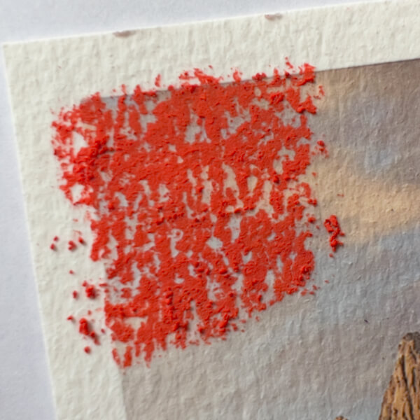
Did you know you can collect pastel dust and broken bits, and easily re-form sticks with it? Surprisingly, I learned this rather late. Here’s a quick guide on how to make pastel sticks from broken pastels.
Gathering Pastel Bits and Dust
It’s annoying, I know. Sometimes you’re painting away with your soft pastels, and tiny bits breaks off. Other times, a particularly fragile stick seems to crumble, when painting too aggressively. Maddeningly, these remnants are too small to hold.
Further, while you work, little piles of pastel dust collect on the easel’s shelf. Argh!
Every so often, I used to wipe both the bits and dust away with a damp cloth.
Now, however, I collect it all in little marmalade jars and condiment cups. Pastels are expensive, they will only get more costly, and I was raised to be thrifty.
Squeee! A reason to collect little jars!
As I work on a painting, I sometimes use a lot of similar colors at once. That means the dust that gathers on my easel’s shelf is also similar in color. Other times, I change colors frequently, creating a multicolored dust.
In both cases, every so often I carefully sweep the dust and broken bits into my little jars, sorted by color. (Multicolor dust makes interesting shades of gray.) I store these until I have enough to form a stick.
Tip: Try lining your easel’s shelf with a smooth paper or Glassine. Then, as pastel dust collects, tip the paper every so often into a jar. Tap gently, so the pastel residue slides off the paper without creating airborne dust.
Note: Pastel dust shouldn’t be breathed. Read my complete, no-nonsense guide to Working Safely with Pastels.
How to Make Pastel Sticks from Broken Pastels
Once a little bottle of collected pastel bits gets full enough, it’s time to make a pastel stick.
I live in Germany, so my Distilled Water has a German accent.
Materials
A bottle of collected pastel dust and bits
A small glass, metal, or glazed ceramic bowl
A shot glass, to hold a little water
A teaspoon (with a pointy-tipped handle, if you have one)
(A toothpick if your spoon’s handle isn’t pointy)
Distilled water (distilled won’t add any hard minerals, but regular water will do in a pinch)
A way to create water droplets: a clean pipette (dropper), the tip of a retractable pen casing, a pencil, etc.
A scrap of plastic wrap, smooth paper, or Glassine
A crumpled scrap of paper, opened and laid flattish
Instructions
Put the dust and pieces in the bowl, and crush any clumps with the back of the spoon. Aim for an even powder.
Pour a little water in the glass.
Then, using distilled water and your dropper, apply one drop of the distilled water to the pastel dust. Mix them together using the pointy tip of your spoon’s handle, or a toothpick.
Add more drops one by one, mixing each in well, just until you have a thick paste that sticks together.
Place the paste on a scrap of plastic wrap, or paper, and roll it into a firm stick.
Crumple a scrap piece of paper well, then open it up kind of (but not too) flattish. Place the stick gently on the paper, which will allow air to get under the stick. (You can also finely accordion-fold the paper.)
Let the stick completely air dry. Unless it’s really humid, two or three days should be long enough. (If the stick feels cooler than room temperature, it may still be damp inside.)
Use your new pastel color!
I hope you’ve enjoyed this quick guide on how to make pastels sticks from broken pastels.
This is a no-nonsense, straightforward guide to working safely with pastels.
Looking around the Internet, one could get the idea that soft pastels are a dangerous artist’s medium. Unfortunately, there’s a lot of conflicting information available. I cut through the confusion, draw on safety info from several pastel manufacturers, and offer an inexpensive, highly effective solution for dealing with airborne pastel dust.
The truth is that, with a little attention, working safely with soft (chalk) pastels is not hard to do.
[If anyone knows how I can remove the weird spacing in my outline above, please message me, thanks!]
What are Soft Pastels Made Of?
Chalk pastels are a dry medium. These pastels are made from pigment, plus enough binder to form a stick. This means they are one of the most pure, stable, and color-rich media in existence. They do not yellow as oil paint can, nor darken like acrylics. What you see is what you get.*
The term “soft pastels” actually refers to any chalk pastel stick, ranging from harder to softer. Harder pastel sticks are usually square in profile, and hold together quite firmly. Conversely, softer pastels are round, and may crumble if handled aggressively, or when applied with too much pressure.
A pastel’s relative hardness or softness depends on the pigment and the components of the binder. Certain pigments and binders are derived from harder minerals.
The pastel brands I own, from softest to hardest. (Oops, I misspelled Sennelier, i before e.)
So the first consideration is …
Are Pastel Pigments Safe?
I first studied art in college, in the later 1980s. Back then, pastels probably weren’t as safe as they are today. Accordingly, our teachers taught us that some colors contained toxic pigments.
Fortunately, manufacturing knowledge, and safety considerations, have advanced since my college days. Some toxic components have been replaced with safer alternatives. Nevertheless, many art supply manufacturers still use a few controlled components in very select colors, like cadmium in red. Albeit, the level of the toxic component is so low, they pose no additional risk over the non-toxic ingredients.
To state that differently: Yes, some so-called toxic ingredients may be present, but at such minute levels that they are as safe as the other ingredients found in the artist’s color.
The level of soluble cadmium in the pigments is so low that no hazard warnings are needed, and they pose no greater risk after swallowing or breathing in than other pigment types.
— Winsor & Newton
Are Pastel Binders Safe?
The answer must be yes, or all pastels would be required to come with safety warnings. The “Safety Standards and Warnings” section below applies to all ingredients found in chalk pastels, pigments and binders alike. Further, it’s informative to know what the companies themselves say, about working safely with their pastels and other products.
This depends on the fixative brand and how it’s used, of course. Check the label of your fixative for more information. Most fixatives contain an (acrylic) resin mixed with a solvent, and should be sprayed outdoors.
The only natural fixative I’m aware of—and I certainly don’t know them all—is SpectraFix Degas Spray Fixative. As the name implies, it’s based on the formulation believed to have been used by Edgar Degas. Not only does it appear to treat colors with respect, leaving them unaltered, but it’s made with 100% natural, non-toxic materials, is odorless, and is safe to use indoors.
DIY Fixative Recipe
Naturally, since Degas made his own fixative, you can too! This recipe—which uses the same ingredients as the Degas Spray Fixative above—comes from David Blaine Clemmons (sources here and here), who in turn got it from the Reed Kay book “The Painter’s Guide to Studio Methods and Materials.”
Mix:
1 part by volume powdered casein (comes from milk) with
2 parts by volume grain alcohol (like ethanol or 190 proof Everclear) and
5 parts by volume distilled water.
To apply his fixative, Clemmons uses a Preval Sprayer with the inner tube’s end filter removed, since it can apparently get clogged. You can also go the simpler route of application, and use a spray bottle or mouth atomizer to apply it in fine layers. (Larger droplets will apparently disappear when dry.)
Reportedly, 2 to 4 coats of this fixative should be enough, but if you apply it very finely, you may need more. Store unused fixative in the refrigerator, where it should last a few weeks.
(I’m eager to switch to this fixative using the mouth atomizer I’ve had forever … and just found in the first place I looked 😃. Taken altogether, this method is better for the planet than metal cans, acrylic resins, solvents and aerosol!)
Safety Standards and Warnings
When art supply manufacturers source material components, and produce their products, they must adhere to nationally and/or internationally agreed up on safety standards. Accordingly, any possible risks to your safety must be disclosed to you.
In the US, one such safety standard is regulated by OSHA, the Occupational Safety and Hazard Administration. In their brief on Hazard Communication Standard: Safety Data Sheets, they outline requirements for any “chemical manufacturer, distributor, or importer [to] provide Safety Data Sheets (SDSs) […] for each hazardous chemical, to downstream users, to communicate information on these hazards.” Most countries have similar requirements.
That means, if something in your art supplies contains a hazardous chemical, you as the “downstream user” must also be notified by an accompanying warning. These warnings are usually placed directly on the product’s label. Therefore, examine your pastel sticks, fixatives and other art supplies for such label warnings.
By being informed, you can take precautions, to ensure that you’re working safely with pastels.
If there is no warning on your modern, respectable brand art supplies, you can consider them safe. (Old, inherited, purchased-at-a-yard-sale art supplies, or from cheap sources such as dollar stores, might be a different story.)
Let’s take a look at what popular pastel manufacturers have to say about their products.
Sennelier
Art supply company Sennelier, who makes one of the most lauded brands of soft pastels, includes the following on their web site. (Emphases are mine, to demonstrate that warnings are provided, where warranted.)
Sennelier products may contain noxious ingredients, which would be indicated on the products in question. Furthermore, MAX SAUER reminds the user that particular care must be applied when handling products that are specified as dangerous on the labels, as required by regulation, that are placed on them. In the presence of such components, MAX SAUER reminds the user that it is always important to respect the following minimal precautions for use:
Do not ingest the product;
Avoid contact with skin and eyes;
Wear appropriate attire and protect clothing, shoes and other clothing accessories;
Keep the product away from a child who could use it alone and domestic animals, notably during use and storage;
If applicable, supervision by an adult when the product is used by a child;
The products must be stored away from light, in a ventilated and temperate environment (between 10 and 30°c).
Faber-Castell is opaque about the safety of their products. Their excuse is, “Due to proprietary information, we are not able to publish our Safety Data Sheets on our website. We generally do not provide SDS information to the public.” A search of their web site provides little additional information. Frankly, I am not impressed.
Prismacolor (NuPastel)
I could find zero information about safety on the Prismacolor web site. The word “safety” is not mentioned anywhere. I find that baffling.
Royal Talens (Rembrandt Pastels)
On the other hand, I am encouraged by Royal Talens. They make Rembrandt pastels, as well as many other brands of art supplies. Fully transparent about the safety of their products, Royal Talens offers Safety Data Sheets (SDSs) on all relevant art supplies.
As of this date, Royal Talens lists no SDSs for pastel sticks, making it clear they contain nothing known to be toxic. The only relevant mention is for their pastel fixative. If you want to completely minimize any possible exposure to noxious components, to ensure you’re working safely with pastels, it appears that Rembrandt would be a very good choice.
A well ventilated room represents a preventive measure here. When substantial quantities of dust are involved, a dust mask of filter class 2 is to be worn, while masks with filter type A2 and protective breathing equipment of filter class 2-P2 […] affords protection against solid and liquid particles in the air. A further means of protection involves the use of a suitable extraction hood equipped with filters for the substance concerned, that is, appropriate fine-pored absorption mats for dust […].
For this last point, building an extraction hood to collect pastel dust certainly sounds useful … but also very expensive. I think an alternative will do, therefore I recommend a Corsi-Rosenthal box, detailed below.
Art Supply Sources: Authenticity, Quality, Price
Getting the best price isn’t everything. Consider where you source your pastels and other art materials from. Purchase the best you can afford. When possible, buying straight from the manufacturer assures that you get an authentic and fresh product, produced according to the company’s latest standards.
I’ll say it right up front: I’m not a fan of Amazon. Buying from a second or third party, especially (but not exclusively) an unfamiliar company, may be cheaper, but also carries risk. Amazon is a “second party” at best (I’m guessing they usually buy from the manufacturer, to re-sell). Some of Amazon’s Marketplace sellers are “third parties” or worse (buying stock from re-sellers, to re-sell).
Some products from these companies may be lower cost, because they are from older or damaged stock. Furthermore, they could be “seconds,” containing a slight deviance from usual manufacturing standards. For example, pencils may already be broken inside, or be more prone to breaking during use, or have a sub-par wood casing that splinters during sharpening. Old supplies, or off-name brands, could contain less desirable ingredients. They may also be dryer, or have separated, or show color shifts between areas that were light-exposed, vs. under their labels (I’ve seen this happen with cheap pastel sticks). From one purchase to the next, off-brands may have inconsistent colors. Likewise, paper too degrades as it ages. (Have you ever bought a case of mega-sale computer printer paper that created a lot of dust, or jammed more frequently? It was arguably old and beyond its intended shelf-life.)
Best Sources
All that said, I’d be willing to place higher trust in the sourcing and product turn-around—i.e. freshness—of large, well-established art supply companies, like Jerry’s Artarama, Dick Blick and Utrecht in the US, and Boesner in Europe.
Still, sometimes going right to the source ends up being the cheapest option, or so close in price that it’s the smarter choice. Therefore, I recommend always checking the manufacturer’s web site for comparison.
The Artist’s Best Practices for Working Safely with Pastels
Now, let’s explore some common sense for the pastel artist.
There are three possible ways that a substance can penetrate the body:
Ingestion (eating or drinking it)
Skin absorption, or through a skin-breaking wound
Inhalation (breathing it)
Avoiding Ingesting Pastels
There have long been rumors that Vincent van Gogh may have eaten his paints. There is no evidence that this is true, however. Further, when van Gogh experienced bouts of mental illness, to keep him safe, his doctors kept all liquid art materials out of his reach. That’s because it is, indeed, known that Vincent said he wanted to eat them.
I’ll tell you a not-so-secret secret: like van Gogh, I sometimes find myself wanting to eat my pastels. Why? They just look so good, so beautiful, so yummy! Pastel colors are apparently so stimulating to my high color sensitivity** that my mind wants them to be as tasty as they look. Nevertheless, I will never put one in my mouth!
Naturally, you shouldn’t either. But if you use pastels at the kitchen table, you might already be ingesting them. If you don’t wash your hands before you eat, you may be consuming pastels then, too.
Therefore, to avoid eating or drinking your art supplies, keep them separate from areas of food storage, preparation, and consumption. Similarly, keep them out of the reach of young children and pets.
Don’t make art where you sleep, either.
Also, if you paint in a home studio or room, and want to keep pastel dust out of the rest of your house, have studio-specific clothing. When you are done creating, change out of your studio clothing, preferably leaving them in the studio. Likewise, wash your hands thoroughly, especially before preparing or eating a meal.
Can Pastels be Absorbed Through the Skin?
The short answer is not really. The skin is an impermeable barrier to the components of virtually all pastel sticks. Unsurprisingly, holding pastels can dry the hands, as it wicks away oils and moisture from the skin. And, of course, the pigments can color the hands until you’ve washed. But they are unlikely to penetrate the skin all by themselves.
That said, an exception is if you have a deep enough cut or puncture wound. In that case, anything small enough can enter the body through such an opening, just like bacteria.
Still, let’s remember the first part of this post. If the pigments and binders are non-toxic, or toxic but present in vanishingly small amounts, they cannot poison the body. Even if you are holding a red cadmium-containing stick of pastels with your bare fingers, you’re still safe. Likely, the worst that can happen might be the irritation of a skin-breaking wound, if it is not kept clean and covered. Care for and protect any wounds.
When working with pastels, if you want to be ultra-careful, or prevent your hands from drying, use a barrier hand cream. Two brands are Gloves in a Bottle or Artguard Barrier Cream, but there are others. If you have a wound, use finger cots. Save them for special use, though, as they can create a lot of waste.
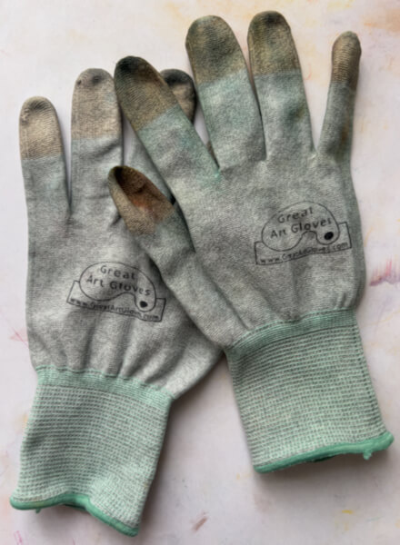
Another option is to purchase sets of washable pastel gloves (originally designed for working with electronics). The fingertips are dipped in foamed polyurethane, creating a pastel-impermeable barrier. My original source no longer offers the gloves shown above, but if you search for ESD fingertip coated, you should find quite inexpensive ones. The gloves can be washed at 40°C (105°F) with neutral detergent and reused many times.
Breathing Pastel Dust
This is the only concern that the pastel-using artist must carefully consider, in working safely with pastels. I have read one account of a very busy, long-hours pastel painter, breathing dust to a level that caused respiratory distress. (She recovered.)
According to her article, breathed pastel dust can irritate the upper respiratory track. Once there, the dust mixes with mucous, is swallowed and eventually expelled from the body. Apparently, truly excessive exposure means dust can possibly enter the alveoli of the lower lungs, and remain there, though no proof is offered. (I’m not saying that’s false, I just don’t know.)
Therefore, being safe and protecting against inhaled pastel dust, is a good idea.
Minimizing and Avoiding Pastel Dust
Don’t blow on your pastel paintings, ever. Doing so is the quickest way to make pastel dust airborne.
Be gentle with your pastel application, to create less dust in the first place.
Avoid using a stiff brush to “erase” unwanted pastel from a painting (doing so also makes the dust airborne). Instead, try erasing with these methods, in this order:
use a small paintbrush to gently dab or sweep away the pastels,
or a cotton swab next,
or a knife or utility blade to gently scrape color away in the direction it was applied,
or a kneaded eraser to dab color off (pinching off or kneading dust into the eraser as you go),
or even a piece of soft, crustless bread.
To remove excess pastel from a painting overall, take it outside (yes, outside!) and gently tap it on the back.
Work on an easel, with the top of your painting slightly tipped towards you. This allows excess pastel dust to fall into the easel’s tray, rather than on the lower part of the painting.
If you’re susceptible to breathing dust, and you have respiratory concerns, I present two options:
Consider wearing an appropriately rated dust mask or respirator. (Caution where respiratory illness or pregnancy is present; talk to your doctor.) If you choose this option, it’s important that you seek assistance with selecting and fit-testing the appropriate respiratory protection, so you’re truly protected.
Build yourself an easy and inexpensive Corsi-Rosenthal box (below), to filter airborne dusts and other particulates in your studio.
More Tips for Working Safely with Pastels
Keep a slightly damp cloth handy. Use it as needed, to wipe your hands, the easel’s tray, and other surfaces that may become dusty.
Cover the floor around your easel and work area with a drop cloth or plastic barrier. The covering can be carefully removed and hosed off or laundered. (When laundering, use a second rinse.)
Spray pastel fixative on your paintings outdoors, where breezes carry the aerosol away from you.
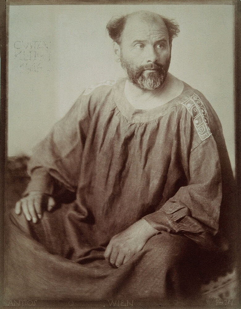
Wear studio-only clothing and shoes, or a good smock that covers you. (I like Gustav Klimt’s, below.) When you are done, leave all garments in the studio, and close the door behind you.
Artist Gustav Klimt in 1914, wearing one of his self-designed smocks. (I need to make a version for myself.)
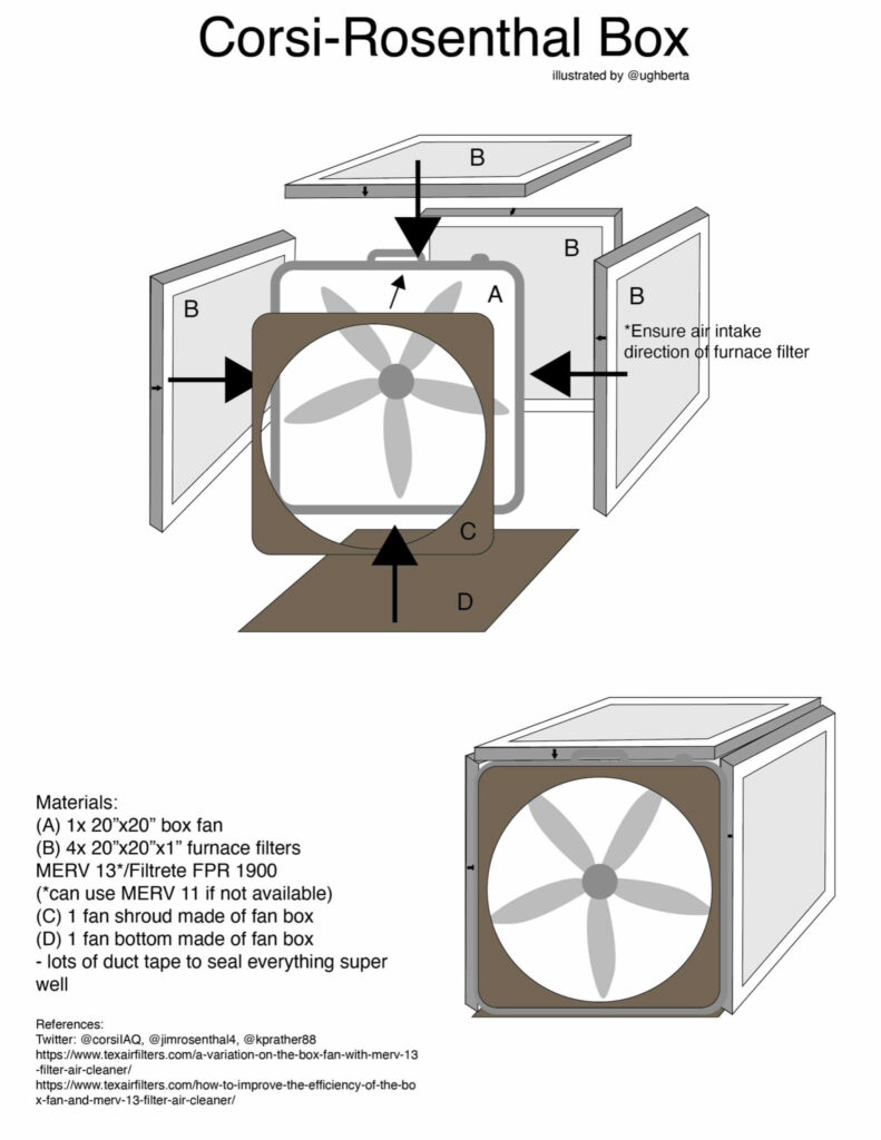
The Corsi-Rosenthal Box
This DIY (do it yourself) project is a straight-forward, inexpensive, and highly effective way to remove airborne dust from your studio space. The Corsi-Rosenthal Box was originally developed to provide indoor air filtration, to increase protection from COVID-19. Subsequently, with a different filter, it is used to filter air contaminated by wildfire smoke.
Rosenthal’s research has shown the following DIY design is the best to date. It outperforms a $1,000 high-end HEPA air cleaner (!!!), and all other DIY designs tested. Depending on use, the filters can last for up to 6-10 months before needing to be changed. (The appearance of dirt on the filters does not indicate they are no longer working.) For more information, see Rosenthal’s related articles.
How to Make a CR Box
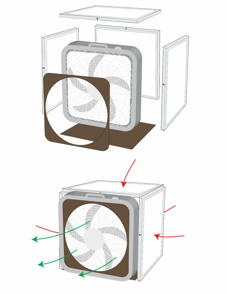
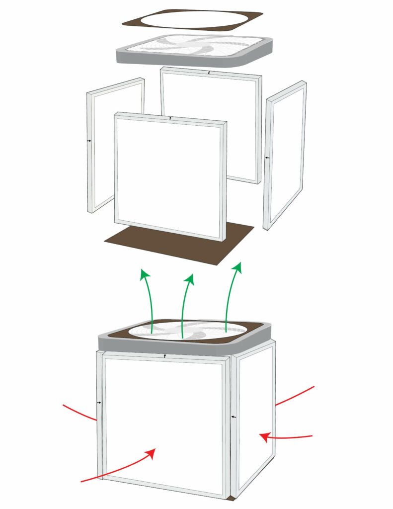
This first illustration lists the materials needed, and shows how the CR Box is assembled. Simply tape everything together, sealing the edges and corners thoroughly. The specific type of filter listed is essential.
Here is the CR Box’s side-lying action. I recommend this setup, with the fan pointing away from your primary work area, to draw through the filters any pastel dust you create:
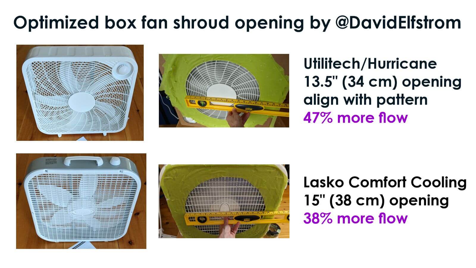
Further, here are two optimized fan shrouds for common fan models (at least in the U.S., I guess), showing that you can also simply use tape. Not as attractive, but it works:
Optimized box fan shroud opening, for specific fans, to increase air flow efficiency. Image by @DavidElfstrom
Some fixatives can darken a completed pastel painting. Test your fixative on a sample of the pastels and paper you’re using, to see its effects. Different pastels and papers react differently. Lascaux Fixative has a really great reputation for no (or minimal) color change, when used as directed. On the other hand, and as mentioned above, SpectraFix Degas Spray Fixative reportedly causes no color shifts.
Further, some pastel colors are fugitive, just like any other colored artist medium. A fugitive color means it can change appearance over time, when exposed to light, air, or for other reasons. This is why, in some old paintings, people’s skin looks bluish. Originally, the skin tones were painted to look natural, but the pigment slowly aged and changed color. Therefore, if using fugitive colors concerns you, check each stick of pastels for its color-fastness labeling. [back to text]
**
Years ago, I took at test where I had to put hundreds of colors in order, and received a 100% accuracy score. Perhaps this is one reason why I am so affected by sublime colors, and endeavor to communicate the beauty I see to anyone who views my work. [back to text]
I hope you have found this blog post to be informative, and helpful, in clearing up any confusion about working safely with pastels!
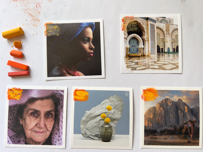
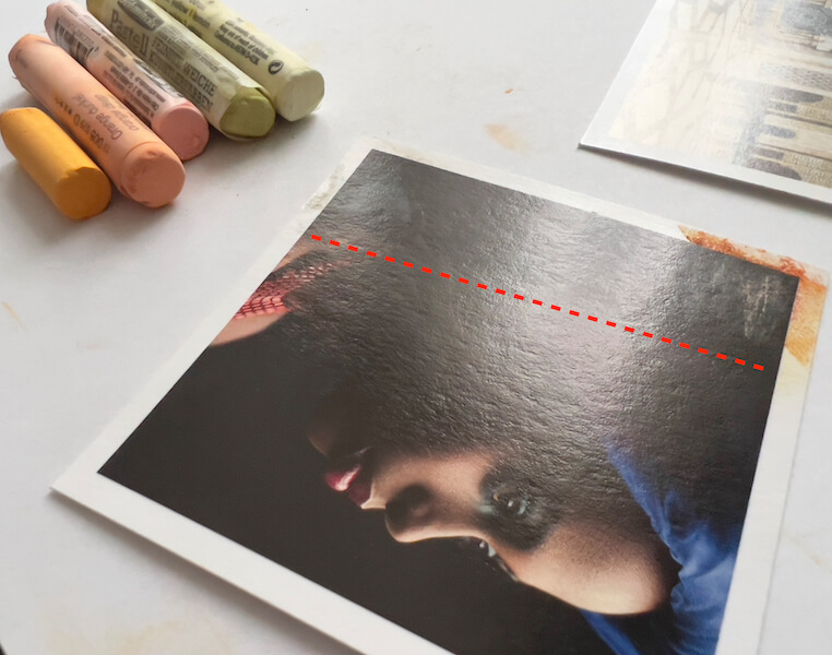
Howdy! If this is the first post in the series that you’re seeing, here’s some background. Lately I’ve been experimenting with painting on photos, to combine two of my strongest skills as an artist. My intended process is to use pastels over fine art prints of my photographs, though I’m likely to add other media too. It’s been an interesting and very informative period of learning.
If you’re also considering painting on photos, reviewing all the parts of this series could give you a jump-start in devising your own process.
Experiment Plan for Painting on Photos
In Part One, Part Two and Part Three of this series, I selected a high-end photo printer, ordered print samples on various papers and substrates, researched painting methods, and gathered supplies. Then I conducted several experiments, using five Hahnemühle fine art photo print samples from White Wall, and their UltraHD photo print. The tests included trying tapes for masking, using soft pastel on the papers (with and without fixative), testing so-called clear acrylic gesso over the prints, applying pastels to the gesso, and texturizing the gesso using a heat gun.
Reviewing the list below, I’ve already completed steps one through six.
Direct dry pastel application in five layers, from hardest to softest pastels.
Another direct application in five layers, using only the softest pastels.
Applying the softest pastel layers with fixative, for a little tooth.
Applying Winsor & Newton Artists’ Acrylic Clear Gesso smoothly, to gauge effect alone.
Testing the gesso with layers of pastels.
Applying the gesso with the heat gun, to create texture.
Testing the textured gesso with pastels.
Layering gesso and pastels, with fixative.
What happens if I finish the painting with a layer of gesso?
This time, I’m completing the last three steps in the plan: experimenting with mixing layers of textured gesso with pastels. In this experiment report, you’ll see I’ve mashed the last three steps together. But first…
Work Space Pointers
Speaking from some (silly) experience, I have thoughts about preparing your work space, for painting on photos with pastels:
Cover your surface with a large piece of paper, or perhaps plexiglass, to protect it. (Careful with plexiglass and excessive heat.) Also cover the floor with something washable or disposable. The wall, too, if it needs to remain free of art-making splatters.
Have the heat gun plugged in and ready to use, making sure the cord is long enough for free movement.
Make sure all containers, brushes, pastels, blending tools, and other supplies, are on the other side of the table from the heat gun. Better yet, somewhere else completely.
Ensure that you won’t be dragging the heat gun’s cord over important parts of the painting, or into supplies.
If needed, fix the artwork (paper) to a board, to make sure it doesn’t blow around when using the heat gun.
Apply pastel, then clean up the work space. Remove any extra pastel dust from the painting by taking it outside (yes, outside!) and gently tapping it from the back. Clean pastel dust off work surfaces with a damp cloth. Otherwise, the heat gun will make all the loose pastel dust airborne, to land wherever, and worse, to be breathed. More about working with pastels safely.
Next, pour out some gesso in a smaller container, then CLOSE THE LID on the bigger jar.
After applying the gesso, cover the smaller container and the brush, to keep moist and protected.
Immediately use the heat gun to texture the gesso. Adjust temperature as needed; today I needed to turn it down to setting 3, from yesterdays 3.5.
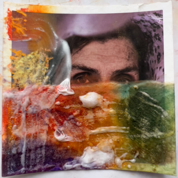
#7, 8 and 9: Textured gesso layered with pastels
Thick Gesso, Thick Pastels
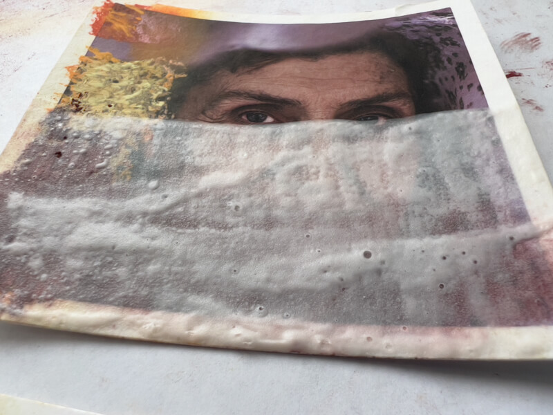
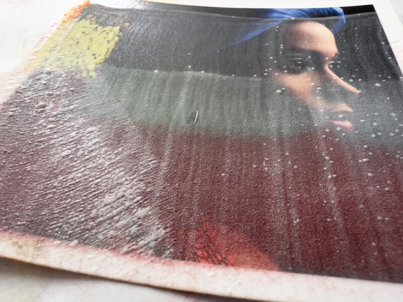
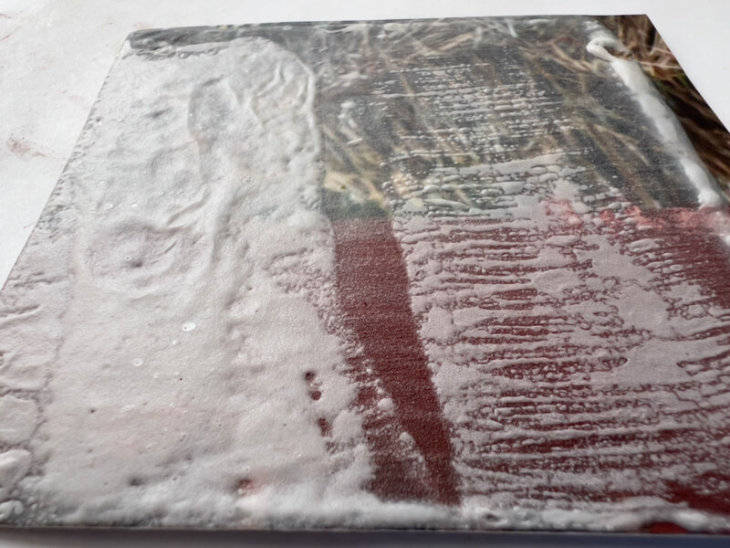
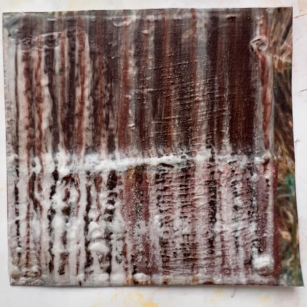
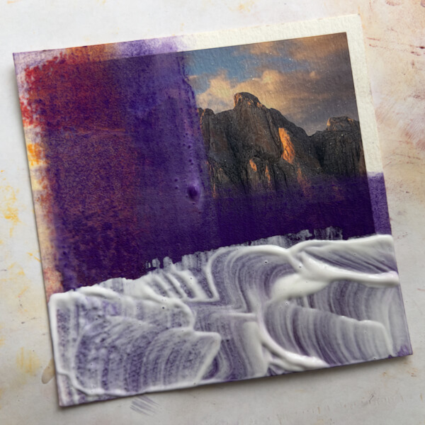
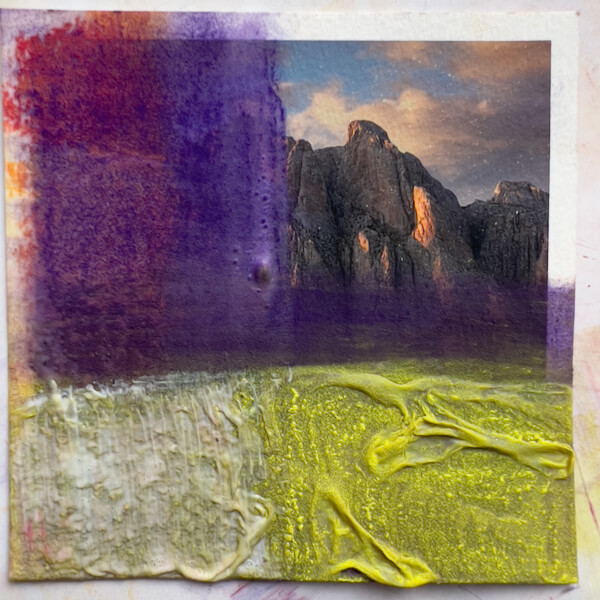
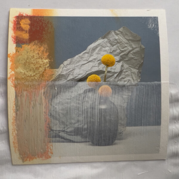
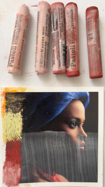
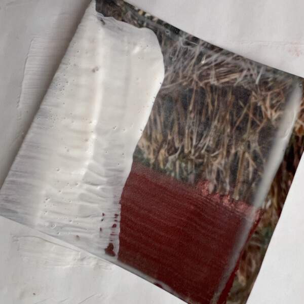
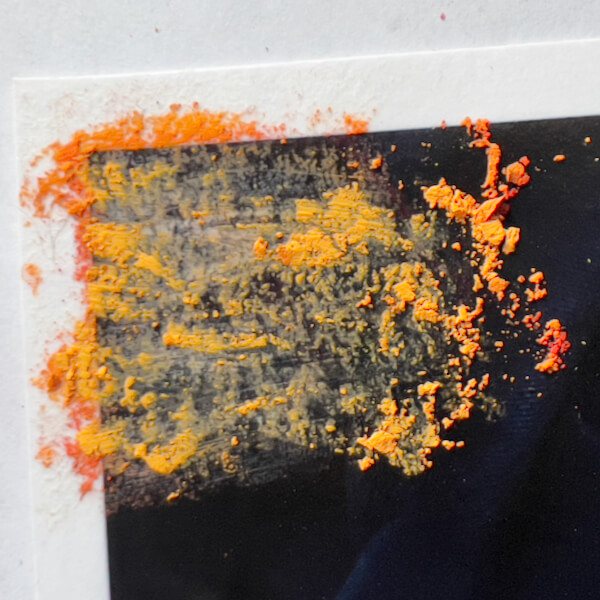
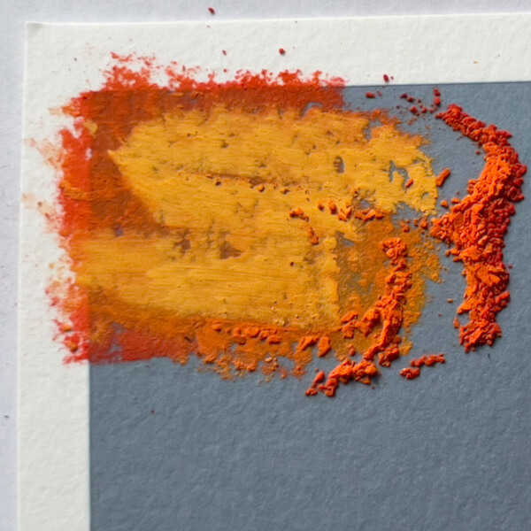
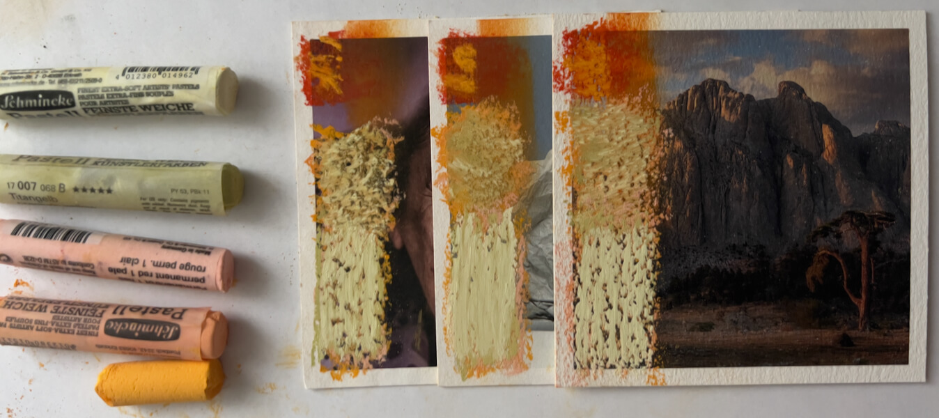
Let’s start with a closer look at one of the test surfaces I created last time, using gesso and a heat gun:
First, I applied several colors over the thick gesso, layering the pastels a little.
Next, I blended the pastels using a piece of pipe foam insulation, turning the foam to avoid polluting the colors.
Since this gesso was thicker, when I rubbed the pastel it gained a sense of depth, and took on an inner glow. This reminded me a bit of encaustics.
I like the appearance at this stage.
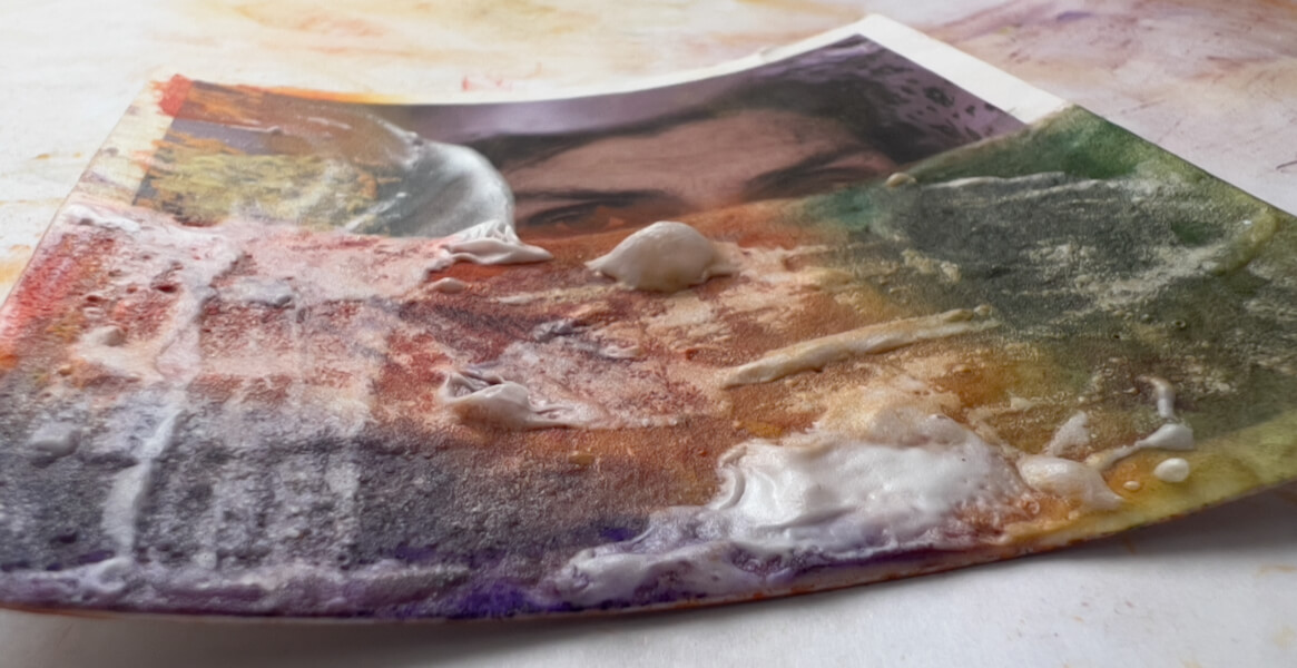
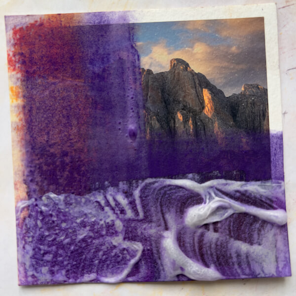
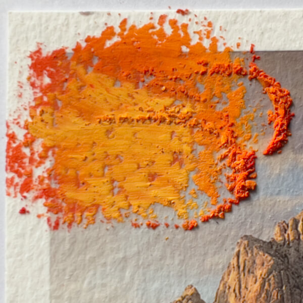
Then I applied a second thick layer of gesso rather haphazardly, just to see what would happen after texturizing with the heat gun. Yes, the brush picked up pastel dust, which was a pain in trying to keep the gesso clean. Here is the gesso, wet:
Once I’d texturized the gesso, the thickest areas left pretty large blisters, not all of which collapsed as they cooled:
Frankly, after trying this, I don’t see a need to add a second layer of gesso. One is enough under a subsequent layer of pastels.
But let’s not stop there, these are experiments, after all!
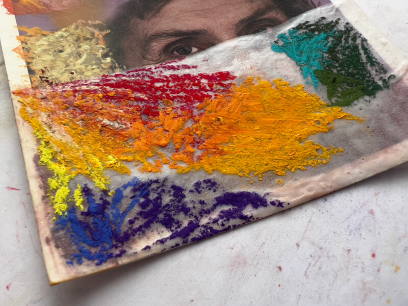
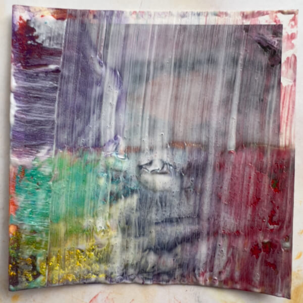
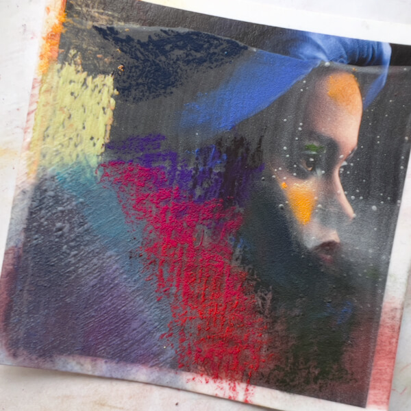
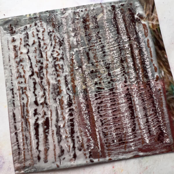
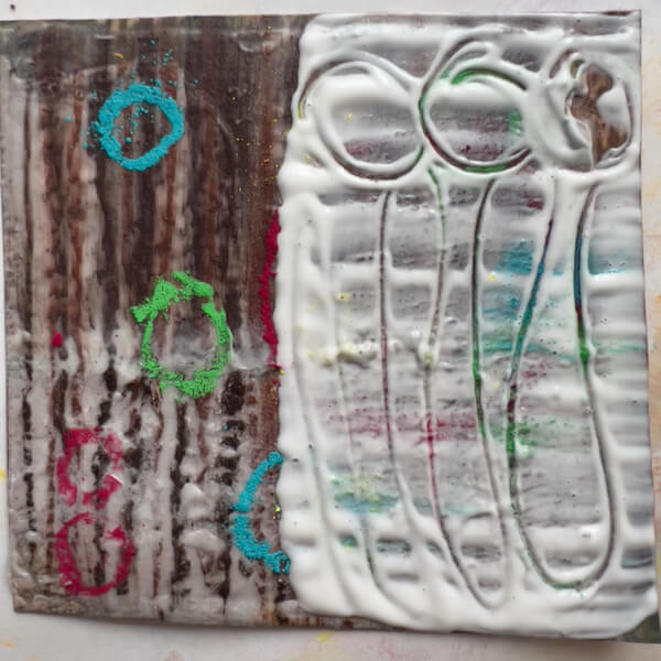
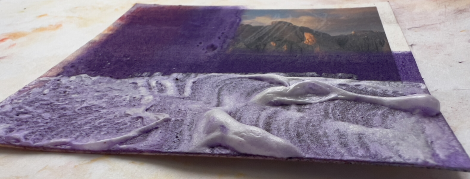
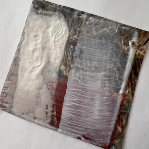
Adding Even More Layers
Yes, I went ahead and tried adding another application of pastels. This time, I layered the pastels quite a bit, which compressed the bubbles:
Now—with the pastels on top again, and contrasting with the previous layer of complimentary colors—this also looks interesting. At this stage, I didn’t blend the colors.
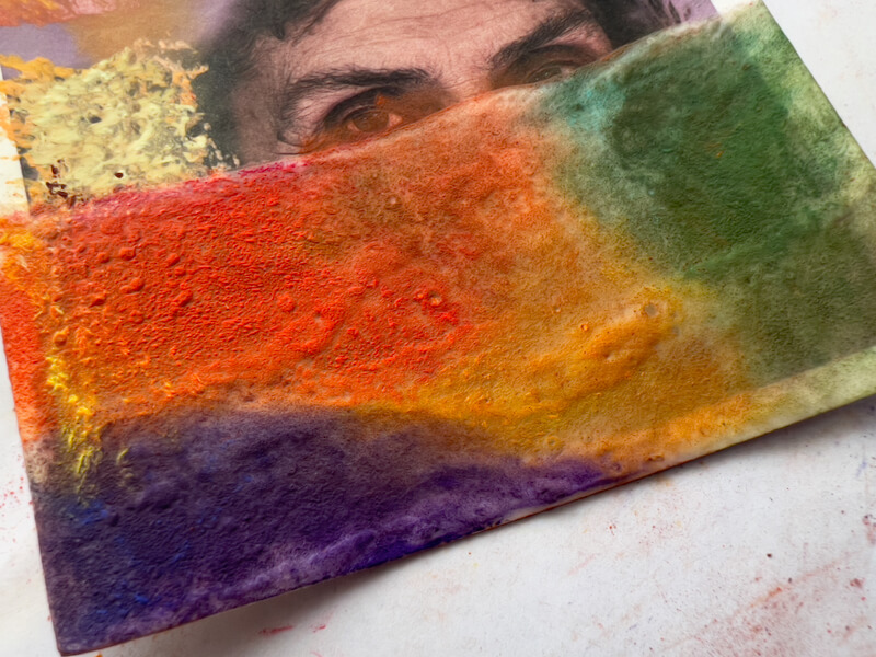
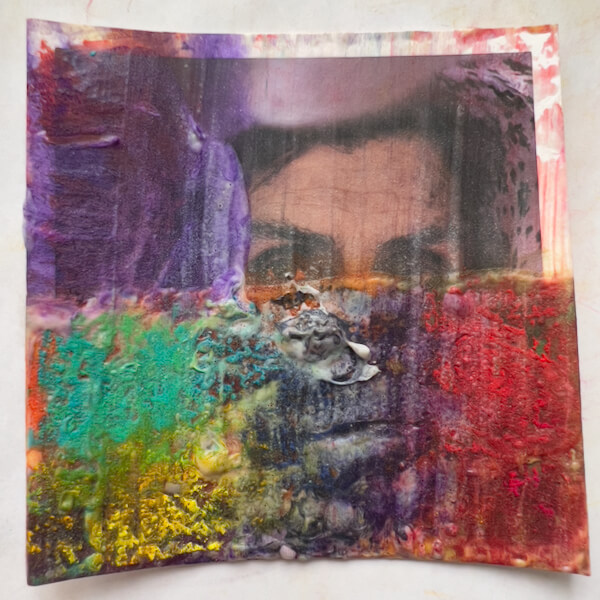
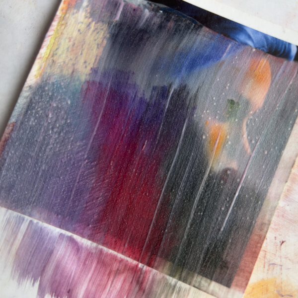
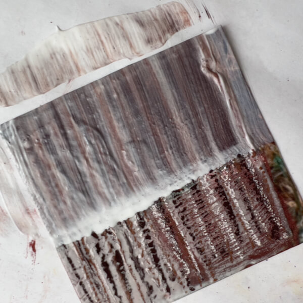
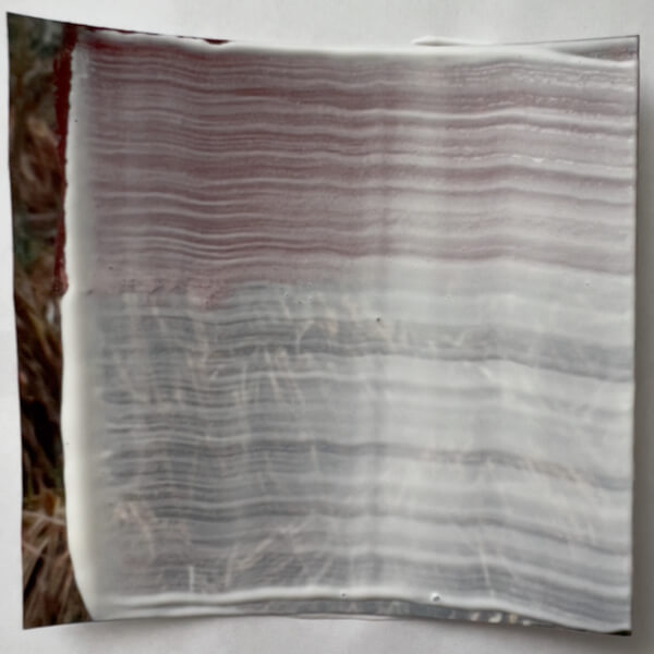
Next, just to know what happens, I again applied gesso. However, this time I applied one coat over the whole photograph…
… and then I textured it again. This was the end result:
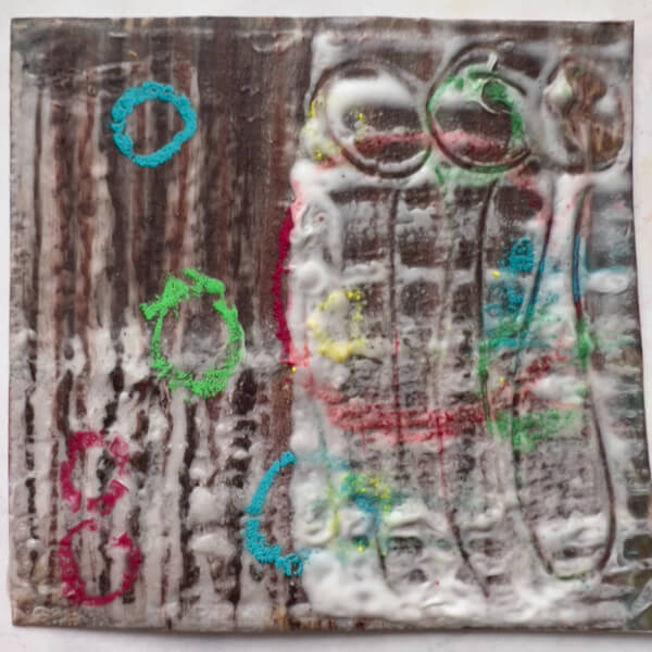
My opinion: Dull. Cloudy. Meh.
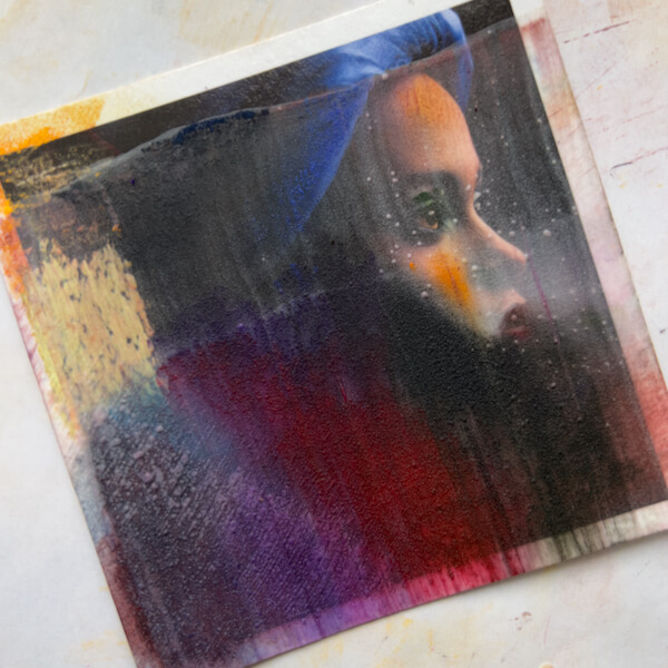
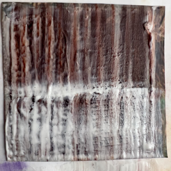
Skipping right to step #9, the answer is no, gesso should not be the final layer when painting on photos. Bummer, as it will still be necessary to apply fixative, and cover the painting with glass. (Unless I discover something else.)
Takeaways
One layer of gesso, textured or not, can easily be enough to add interest, when painted with pastels.
If a first layer of gesso was thinly applied, then painted or blended with pastels, a second textured layer could be useful under a second layer of pastels.
Blending pastels looks good on a layer of thick gesso, adding depth and glow.
Spraying the blended pastels with fixative, then applying a layer of complimentary colors and fixing again, would undoubtedly work nicely as a final layer. (I didn’t do this here.)
Brushing gesso over pastels almost always disturbs the pastels and lifts colors.
Anything more than a thin layer of gesso and a thin layer of blended pastels, obscures the photograph below.
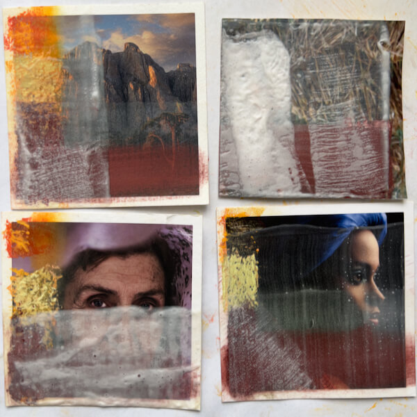
Thin Layers of Gesso and Pastels
Again, starting with a surface I created last time:
Here, I applied single layers of pastels, blending some and leaving some as is. Yeah, this is ugly, but it’s not about the end result, it’s about the process:
Next, I simply painted over it with another thin layer of gesso. You can see that the pastel lifted and smeared quite a bit, leaving residue on the base paper.
I simply left this to dry without texturing.
BORING.
Takeaways
Don’t use this method.
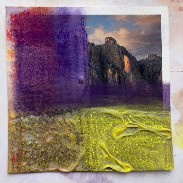
Emphasizing Texture, in Gesso and Color, when Painting on Photos
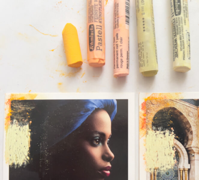
Here’s the starting texture:
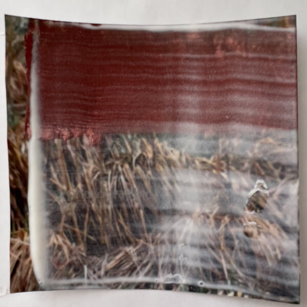
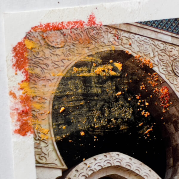
This time I decided to try stress the texture. First, I applied three colors of pastels in stripes:
I think this looks pretty interesting as is, and where the gesso was thinnest, some colors and tones from the photo are slightly visible (upper right quadrant). If I apply gesso and color more sparingly, this might be effective for letting the photo come through.
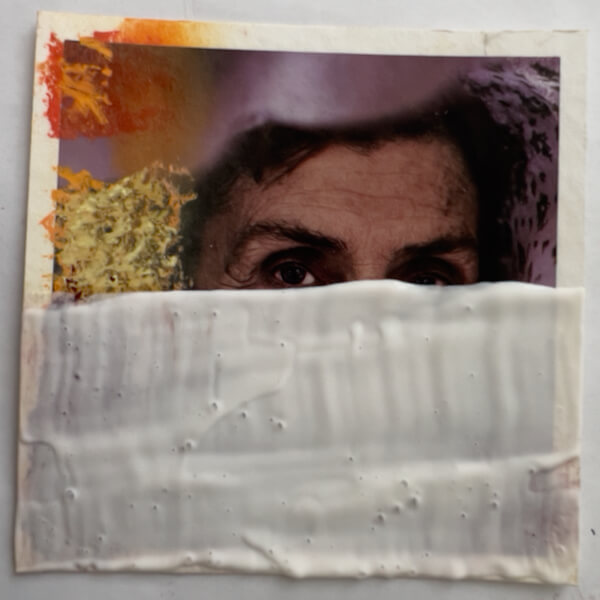
Curious about the result, I rather aggressively applied gesso over the upper half of the image, which again lifted the pastel:
After texturing this layer of gesso, you can see (below) that the pastel is quite smeared. Interesting if that’s a desired effect when painting on photos, regrettable if not.
With a much lighter touch, I applied a layer of gesso to the bottom half, so as not to disturb the pastel:
After texturing, it isn’t smeared. However, the lighter touch also meant more gesso remained:
Since I’m playing with texture here, I drew a few pastel circles, applied some thick gesso, and inscribed lines in it. On the uncoated side (left), I was curious whether the pastel would kind of melt into the previous layer of gesso, if simply heated. This is before texturing:
And this if after applying heat:
The pastel on the left did not “melt” into the surface. However, the gesso impression on the right remained, as expected.
Takeaways
Thin gesso (textured or not) with a light application of pastel allows a little of the photo to come through.
Purposefully textured pastel strokes over textured gesso can yield an interesting effect.
Heavy-handed gesso application blurs the pastel, and vice versa.
Thoughtfully applying or drawing into the gesso may add interest.
Pastel does not “melt” into an under-layer of gesso when heated.
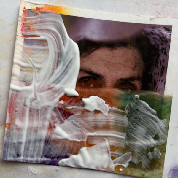
Mega-blistering
Starting with:
I then applied and blended a purple color, and painted on gesso in thick swirls:
Once heated, yielded big blisters that rose and collapsed in interesting ways:
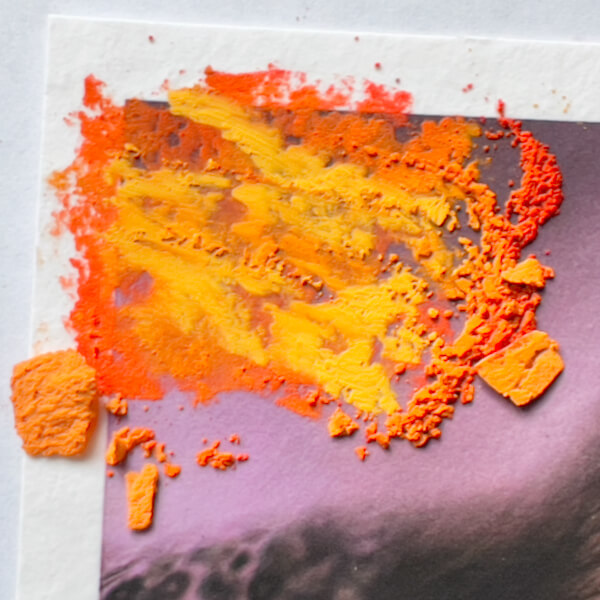
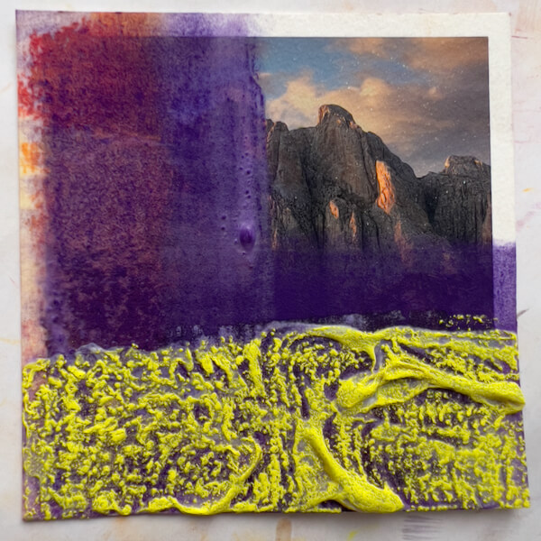
Since I’ve been playing with complimentary colors, I applied yellow:
Then blended the yellow and applied gesso over half:
This time, the yellow seemed to disappear. I’m not sure why, maybe it’s the pigment? Maybe too much was picked up when applying the gesso?
Takeaways
Gesso bubbles can get kind of interesting, and ridiculous.
They’re fragile, too.
If I used fixative on the pastel before applying a second layer of gesso, it would probably remain undisturbed.
Conclusions (for this stage of painting on photos)
It’s all fun and games, until the art gets obscured.
I mean two things by that:
Anything but a light layer of gesso and pastel will cover up the underlying photo.
A final layer of gesso is a no-go.
That said, THIS WAS FUN! I’ve never been interested in doing abstract work, but I can see why this kind of playing-with-art-supplies leads people in that direction. I could drown myself in color and texture.
But I have other desires, goals and intentions with my art at this stage in my development. And now I’m a lot more informed about how I might proceed in painting on photographs.
Another Conclusion
None of this is necessary for painting on photos! I could simply paint directly on the Hahnemuhle Photo Rag—or one of the other receptive papers—with pastels (or other media). As I learned in Part Two, the Photo Rag will take several layers of hard-to-soft pastels, and if sprayed with fixative in between, at least five layers of the softest pastel, Schmincke.
Texturizing is interesting, though, so I’ll continue to experiment with it down the road.
I hope you found this interesting, and possibly a short-cut to developing your own processes.
Moving right along, I’m ready for the next stage of experimenting. (If you haven’t read them, here’s Part One and Part Two of this process.)
Today, I’ll be applying a clear gesso on photographs, to gauge its transparency. Next, I’ll see how the gesso behaves with soft pastels. Finally, I’ll learn what happens when I texture the gesso with a heat gun.
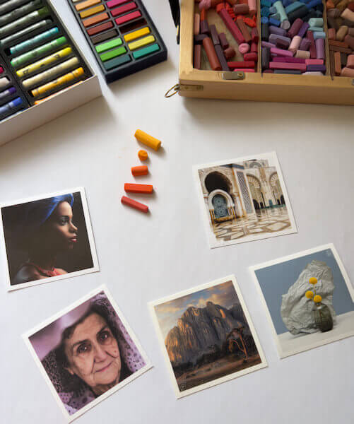
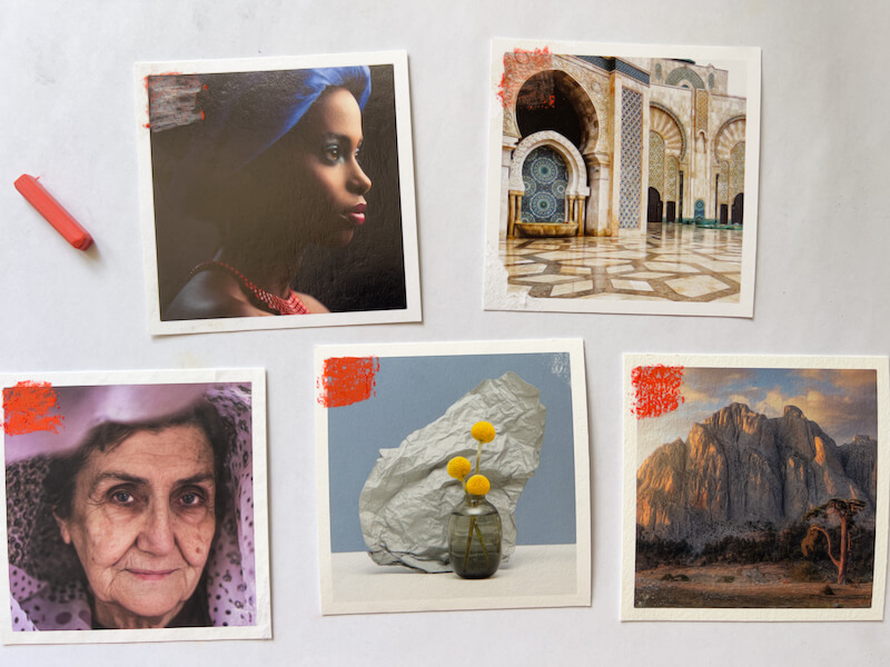
I’m continuing with the five Hahnemühle Giclée photo samples I procured from White Wall: Baryta, FineArt Pearl, Torchon, Photo Rag and William Turner. Further, I cut a square corner out of my much thinner UltraHD glossy sample print, to test as well. How will it hold up to heat?
Experiment Plan for Painting on Photos
As a refresher, here’s the overall plan. I’ve already completed steps one through three.
Direct dry pastel application in five layers, from hardest to softest pastels.
Another direct application in five layers, using only the softest pastels.
Applying the softest pastel layers with fixative, for a little tooth.
Applying Winsor & Newton Artists’ Acrylic Clear Gesso smoothly, to gauge effect alone.
Testing the gesso with layers of pastels.
Applying the gesso with the heat gun, to create texture.
Testing the textured gesso with pastels.
Layering gesso and pastels, with fixative.
What happens if I finish the painting with a layer of gesso?
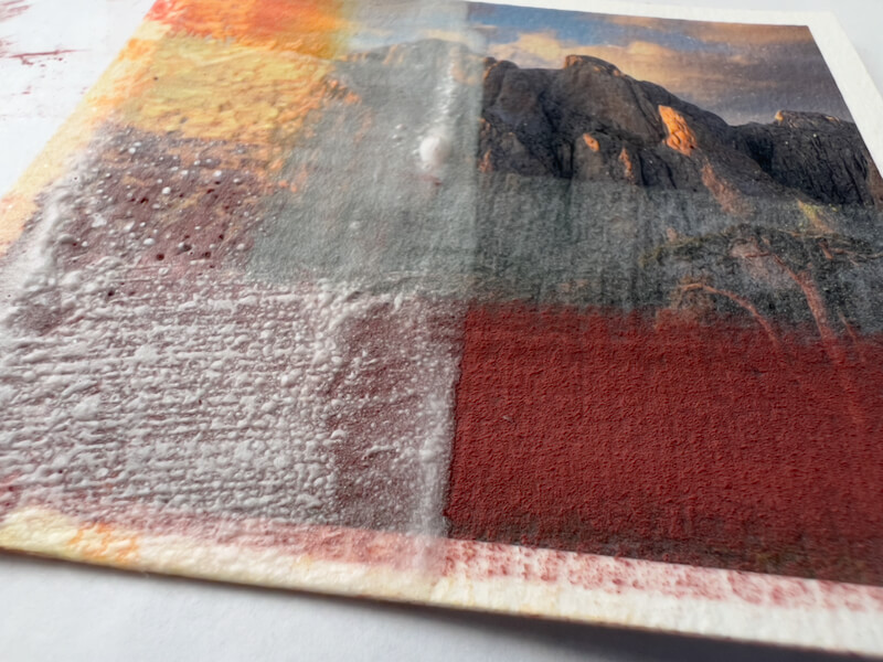
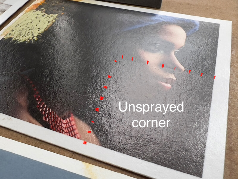
#4: Experimenting with Applying Clear Gesso to the Photos
Previously, I read about a number of top brand “clear” and “transparent” gessoes, and settled on Winsor & Newton Artists’ Acrylic Clear Gesso. On its promotional material and the product label itself, W&N states this gesso is “completely clear when dry.” Naturally, transparency is important to me, so the photo shows through the gesso with minimal change.
However, concerned that the sample Giclée prints might be damaged by applying a wet medium, I decided to spray them with the Schmincke pastel fixative first. As a “control,” I left a corner of each unsprayed to see if it reacted poorly. (Granted, the fixative is wet too, but it’s not being applied with a brush that could push pigment around.)
Wet
Here’s how the gesso looks, shortly after being applied:
Photo Rag with wet gesso.
FineArt Pearl with wet gesso.
Torchon with wet gesso.
William Turner with wet gesso.
UltraHD with wet gesso.
Baryta with wet gesso.
Dry
AARGH! Here’s how the gesso appears, after drying overnight. Needless to say, I’m not terribly happy with four of the six results.
As you can see, Winsor & Newton’s repeated claim of “completely clear when dry” isn’t quite accurate.
Takeaways
On the plus side, the W&N Clear Gesso creates a toothy, matte finish, which should be great for grabbing and holding numerous layers of chalk pastels. In this regard, I am positively impressed. No need to mix marble dust or pumice into a wet medium for tooth.
Because the gesso is matte, all sheens from the glossy surfaces are obscured, rendering them rather pointless when being painted over.
Fortunately, contrary to how regular ink jet prints bleed and smear when wet (Giclée is a form of ink jet), none of the photographs tested appear to have blurred from the application of the gesso.
Ranking the Papers by Gesso Clarity
The Winners
Photo Rag, gesso dry. See big Best for painting on moodier, shadier, or lower-light photos.
FineArt Pearl, gesso dry. See big Best for painting on photos that benefit from an inner glow.
Perhaps the best result of gesso clarity is on the Hahnemühle PhotoRag, an already matte paper, with the smoothest of the matte surfaces in this trial. Luckily, I was already favoring this paper for its relative lack of texture, so I’m really happy that the gesso is nearly clear when applied in a thin layer, only every so slightly darkening and dulling the photograph. Further, if I want to leave parts of a photograph completely untouched, this would be the least noticeable transition between gesso and pure print. The paper itself is not as bright as others, so this should work best for moodier, shadier, or lower-light photographs+paint applications.
Interestingly, when painted with the W&N Clear Gesso, the Hahnemühle FineArt Pearl retains its merit. The gesso is pretty translucent, with just a hint of dulling, and cloudiness in the darks. While it obscures the surface refraction of the pearlescent finish, the print still looks quite good, with an inner glow. I will also be using this paper for painting on photos, since it’s a great choice when the photograph would benefit from a feeling of refractive light.
The Rest
Next in line is the Hahnemühle Torchon, which didn’t take the gesso badly, but it looks a bit dull and milky, despite the already matte print.
In this test, it was a tie for the next worst performance of the W&N Clear Gesso. Sadly, the printed image on the William Turner was markedly dulled and obscured by the gesso. Similarly, the UltraHD glossy was muted, and unsurprisingly, for its cost and sharpness, using gesso on it seems a waste. (These two papers and printing methods are really gorgeous, so I’ll also save them for straight-up photo prints that won’t be painted on.)
Regrettably, the gesso performed the worst on the Hahnemühle Baryta, looking the milkiest against the largely dark image. (Would it look similarly cloudy on the other papers, if their images were as dark? Perhaps.) While I won’t use this paper for painting on photos, it’s a lovely paper for dark photographic prints.
Can I Make the Gesso Clearer?
Disappointed that gesso on the Baryta is so milky, I wondered if that would reduce if sanded. Therefore, I filled the sandpaper block with 120 grit paper and sanded a little. First, I tried brushing away the residue. Next, I tried moist-wiping away the residue.
Um, NO, definitely doesn’t help. I suspect a finer grit wouldn’t, either. Why did I think this would work?
Gesso sanded in two small patches (middle right).
#5: Testing Gesso with Pastels
Moving on, I applied five layers of Schmincke pastels, the softest soft pastel, with no fixative between. Here’s how it looked on one of the samples:
Five layers of Schmincke, the softest pastel, on the gesso (lower left from red to pink).
Unfortunately, with no fixative, the fifth layer started smearing.
Takeaways
The gesso could only take 4 pastel layers.
I won’t bother testing with fixative, surely that will work as before.
#6: Gesso + Heat Gun = Texture
Now for the trickiest test! I’ve never used a heat gun; this will be interesting. (Don’t try this at home, kids! I’m just blogging about this for my own reference later. Not responsible for the injury of others, etc., etc., yadda, yadda.)
Heat Gun Method
Looking back at Cory Goulet’s instructions, her recommendation for creating texture in the gesso is to (I paraphrase):
Pour a little gesso into a container. Using a wide brush, gently apply a smooth layer of gesso over the pastel, carefully as to not muddy the gesso or lift the pastel. (Only apply to a small section, and texturize it as described below, before moving on to another section.)
Keep in mind that the thicker the gesso layer, the more texture, but also the cloudier (Goulet was using Liquitex, but this seems true for Winsor & Newton too, alas).
Safetythirdfirst! Know how to operate your heat gun properly and carefully, before proceeding. Be sober. Avoid loose hair, clothing, curtains, and jewelry. DON’T TOUCH THE TIP OF THE GUN WITH ANYTHING!
Start with the heat gun on the lowest temperature setting, and the gesso just applied. Very slowly, sweep the gun over the gesso to texturize as desired (rippling, bubbling). Gradually adjust temperature setting and movement speed, if needed. (I ended up using a higher temperature.)
When done, cool the heat gun, and cool and fully dry the gesso before adding pastels.
Flatten buckled paper under a weight, if necessary.
See Goulet’s article, linked above, for more details.
Experimentation Hesitation
Naturally—being the appointed family campfire-maker and fireplace-tender in my youth, then graduating to being a fire dancer, I have an informed respect for heat and fire. (Crazily, I have singed my eyelashes, but not my eyebrows, doing a buzz saw with fire poi.)
Back to the experiments at hand, I proceed with caution.
Believe it or not, I’m a little nervous about using a heat gun. I must be doing something right.
“Do one thing every day that scares you.”
— Eleanor Roosevelt
This is how it turned out on the initial round. First, I learned that the lowest heat setting just dries the gesso without texturing it, even if I hold the heat gun still over an area of gesso. Same with heat level number 2. And number 3…
The UltraHD paper with a second layer of gesso, before the first heat gun test.
After the first heat gun test, on the lowest setting. No bubbling or rippling. (I marred the gesso by accident.)
Experimenting Success!
Finally, I turned the heat up to 4. Texturing occurred! However, that was a little too hot, so I lowered the setting to 3.5, which seems perfect for my heat gun.
Here’s the Torchon paper, with a second layer of gesso, before applying heat. Bubbles are from the brush.
… and the UltraHD paper, also before a heat gun test. Bubbles are from the brush.
The UltraHD paper, after the higher heat on left, and with a new thin layer of gesso, right. See big
Four papers after the high heat test, with thick and thin gesso applications. See big
Takeaways
The bubbling and rippling from the gesso being heated is an interesting effect. Unfortunately, the gesso was made less clear by heating, where texturing formed. Oh, well.
This process is a lot slower than I anticipated. For some reason, I envisioned high-force blowing, like a hair dryer, or a torch lighter, but nope.
As phenomenal as they look, the UltraHD photo prints by White Wall are not great with heat. The emulsion can separate from the thin paper.
Fortunately, the Hahnemühle Baryta, Torchon and William Turner had no issue with the heat gun; no damage to the image and very minor paper buckling, due to the gesso’s wetness.
My Makita HG6031V heat gun should be set to 3.5 (out of 9 heat levels), to get the gesso to ripple and bubble.
Naturally, a thin application of gesso will bubble faster. Bubbles form along lines left by the brush.
If the brush has left bubbles, they don’t go away with heat. This is a plus, if desired.
Thick applications of gesso pool more, and ripple and bubble in random ways. Likewise, they are nearly impossible to see through, so should only be used in areas where transparency doesn’t matter.
Any indentations in the gesso are retained. Accordingly, experimenting with texture could be worthwhile. Try intentionally adding texture before applying heat, to introduce patterns, movement, focal points, etc.
This should go without saying, but don’t touch the gesso until you are certain it’s dry. Also, once dry, any bigger bubbles can deflate when pushed, so only touch with intention.
Reflection
After waking up the next morning, and having processed some of my emotions from these tests, I have to say I’m really quite disappointed with the overall lack of clarity with the gesso. I feel misled by Winsor & Newton. I was expecting something like a gel medium that dries clear, even when thickly applied. Expectations are dangerous, I know, but W&N set the bar high!
Further, I ordered the gesso directly from Winsor & Newton, so it would be fresh and authentic, to be certain I wasn’t getting an old or fake product. And, of course, thinking I’d be using it for a long time, I ordered the largest size offered, to “save money.”
Of course, I can’t blame the gesso for changing to a white color when heat is applied. That said, the fact that it’s not the “completely clear when dry” it says on the label is really false advertising, in my way of thinking. I may write them a letter to express my disappointment. Bah! Humbug!
Still, I’m really pleased with the fact that a thin coating on two of the papers worked well enough. Again, I’ve learned a lot from this round of experimenting.
What’s Next?
Fun! I’ll be with layering pastels and gesso, to see what painting on the surface is like, and to play more with texturing in a thoughtful, purposeful manner. Stay tuned for the last installment!
If you’re new to my blog, at this stage in my artistic development, I’m experimenting with painting on photos. Being both a photographer and painter, I want to combine these strengths! My preferred painting medium is soft (dry) pastels, which I plan to use over professional Giclée prints of my own photographs.
Unfortunately, pastel can be smudged unless placed under glass. I’d like to avoid that, since even expensive museum glass feels like a barrier to visual entry. Therefore, I will likely resort to using a wet medium in the process, to hold and bind the pastel, and perhaps as a final coat. We’ll see how that goes.
I’m experimenting on gorgeous photo samples that I ordered from the award-winning printer White Wall. They presently use five Hahnemühle papers: Baryta, FineArt Pearl, Torchon, Photo Rag and William Turner. Later I’ll move on to testing the aluminum surfaces I ordered, also from White Wall.
Recap of Part One
Earlier this week, I posted Part 1 of this process. There I discussed choosing White Wall, investigating paper surfaces, reviewing methods for painting on photos, and gathering supplies. Then I experimented with tape for masking, to see what would happen when I pulled each brand off the fine art prints. The results, with the tapes I tried, weren’t good.
That experiment done, next I needed to devise…
An Experiment Plan, for Painting on Photos
Yesterday, I nearly dove into applying pastel to one of the papers. However, I realized I’d better be strategic, or I’ll use up my small samples too quickly. Making the most of this opportunity calls for a thoughtful approach, to get comprehensive results.
My Plan
Based on the painting methods I’d reviewed (see Part 1), I decided to break my ideas for painting on photos into stages. I added steps as I went along, and this is my plan, so far:
Direct dry pastel application in five layers, from hardest to softest pastels.
Another direct application in five layers, using only the softest pastels.
Applying the softest pastel layers with fixative, for a little tooth.
Applying Winsor & Newton Artists’ Acrylic Clear Gesso smoothly, to gauge effect alone.
Testing the gesso with layers of pastels.
Applying the gesso with the heat gun, to create texture.
Testing the textured gesso with pastels.
Layering gesso and pastels, with fixative.
What happens if I finish the painting with a layer of gesso?
Considering the small 4.3 x 4.3 in. (11 x 11 cm) sample prints from White Wall, that’s a lot of testing!
For this blog post, I completed steps 1-3 above.
Direct Dry Pastel Application in Layers
Different pastel brands have different hardness, and it’s best to layer from hardest to softest, so that the paper’s tooth isn’t saturated too quickly. Once that happens, additional pastel layers won’t stick.
Considering the pastel brands I have on hand, that means testing pastel layering in this order:
The pastel brands I own, from softest to hardest. Oops, I misspelled Sennelier, i before e.
Naturally, I won’t be using all those brands for every artwork. I mostly use NuPastel, Rembrandt and Schmincke, simply because I currently own more colors in each. Further, I may want to use a lot of Schmincke and none of the others, for the same reason.
#1: Five Layers of Pastels, Hard to Soft
For good measure, I started with one layer of each brand listed above. This is how it went, in my first experiment of actually painting on photos.
First, a single color of NuPastel applied:
One layer of NuPastel color, applied to each photo paper. The top two photos were scratched by the pastel stick.
NuPastel scratched the Hahnemühle Baryta Giclée print. It also didn’t stick to the paper much.
NuPastel scratched the Hahnemühle FineArt Pearl Giclée print. It stuck to the paper even less.
NuPastel on Hahnemühle Torchon, which is semi-textured.
On the Hahnemühle Photo Rag, which is smoother.
NuPastel on Hahnemühle William Turner, which is very textured.
Next, after all five brands (five different colors, hardest to softest) were applied, this is how the papers looked:
All five papers with five layers of pastel applied, from the hardest to softest brands of pastels.
Five layers of pastel on Hahnemüle Baryta. Once the extra was knocked off, only a little remained.
The same five layers of pastel on Hahnemühle FineArt Pearl. Once the extra was knocked off, almost none remained.
Five layers of pastel on Hahnemüle Torchon. A fair amount of paper texture shows through.
Again, five layers of pastel, this time on Hahnemühle Photo Rag. Very little texture shows through.
Five layers of pastel on Hahnemüle William Turner. The most texture shows through.
Then I tried blending the layered pastels using a bit of pipe insulation:
All five papers with the five layers of pastel, blended using a bit of pipe insulation. The pastel on the Baryta and FineArt Pearl (top) was mostly erased. A nice, translucent layer remains on the matte papers, allowing the photograph to show through.
Takeaways
Glossy and pearlescent surfaces—Hahnemühle Baryta and FineArt Pearl—won’t hold pastels (not even one layer), without some other medium applied to create tooth. Further, the harder pastels will scratch these surfaces if applied directly. When rubbed with pipe foam insulation, the pastel is nearly erased.
The matte papers—Torchon, Photo Rag and William Turner—are just fine with five layers, consisting of each of the brands.
Naturally, the textures of the matte papers affect the pastel appearance, with:
William Turner being the roughest
Photo Rag fairly rough
Torchon the smoothest
When applied pastel is rubbed on the matte papers, the five layers of pastel spreads well. That said, one would generally blend one layer, or the earliest layers, when applying pastels, and then leave pastel strokes showing on later layers.
A Note on the Dulling of Pastel Color through Blending
Dry stick pastels are essentially crystalline, hence their luminosity. I’ve read that blending (rubbing) breaks down their structure and dulls them. Honestly, I’m not sure if I buy that. After all, the pigment in its raw form is ground very fine, before it is mixed with binder and formed into pastel sticks. Perhaps I’m wrong, but it seems that any crystalline structure is already powdered in the process. Would rubbing, then, do any worse damage to its structure?
If a color seems duller after being blended, I think there are other causes. Perhaps one may be the result of pushing the pastel into the paper fibers, leaving less color on the surface to catch the light. Alternatively, dulling of the color could occur when it blends with other colors underneath—whether other pastels, or a base color in another medium—leaving it less “pure,” with reduced vibrancy. (Surely, this phenomenon has been formally studied by color manufacturers, as they test the application of their colors to various surfaces.)
#2: Five Layers, All Schmincke (the Softest Pastel)
For experiment number two, I applied five pastel layers using only the softest pastel brand, Schmincke.
The matte papers with five layers of the softest Schmincke pastel, with no fixative. You can see on the second photo, the Photo Rag, that the fifth color barely stuck. On the bottom, the William Turner, it stuck some. However, the paper was pretty saturated, and the last layer of pastel smeared.
Takeaways
Without any fixative, all five matte papers can accept 5 layers of Schminke soft pastels, but do better with less.
Unsurprisingly, with the Torchon—the smoothest—it started to feel like it was getting saturated at the third layer, seemed mostly saturated at the fourth layer, and barely took a fifth application.
Surprisingly, the William Turner—the roughest—also started to get saturated, but not until the fourth layer. The fifth layer behaved better than on the Torchon, yet started to smear.
Only the Photo Rag seemed to take five layers of the Schmincke well.
I might not want to use so many layers on much of the photo prints anyway! But it’s good to know the limits.
#3: Painting on Photos with Five Schmincke Pastel Layers, with Fixative
Knowing that the paper fibers could get easily saturated, I started by spraying the left side of each paper with Schmincke pastel fixative, and again spraying each pastel layer after it was applied.
The Baryta darkened slightly, after the fixative was applied. The Pearl also showed a very minor darkening.
The Baryta partly sprayed with fixative (from top to the red line), showing a little change in the darkness.
After five layers of the softest pastel brand were applied with fixative, here were the final results:
The matte papers with five layers of the softest Schmincke pastel, this time using fixative before and between each layer. All the pastel layers worked. Here you can see that the middle paper, the Photo Rag, is the smoothest, and the William Turner on the right is the roughest.The Baryta and FineArt Pearl papers with five layers of the softest Schmincke pastel, this time using fixative before and between each layer. All the pastel layers worked.
Takeaways
Starting with fixative was probably not necessary with the matte papers, but it was essential to the layering of pastel colors on glossy and pearlescent prints.
Spraying in between every layer made it possible to build five layers of the softest pastel, on every single Giclée print!
The fixative slightly darkened the glossy and pearlescent papers, especially where they were already dark.
No noticeable darkening happened on the matte papers.
Well, that’s it for today! I’ve already started the next round of experiments with painting on photos, but they will save for the next report.
In my newsletter last month, I mentioned plans to experiment with painting on photos. How has it gone so far? The short answer is: slowly, but I’ve learned a lot already!
Getting Photo Prints
The first hurdle was deciding where to get my photographs printed. I got help from a professional photographer, who has become a casual mentor. [Note: If you’re considering looking for a mentor or mentee, check out this excellent podcast “The Photo Mentor and Mentorship.”] When I mentioned wanting to find a high-quality photo printing company, he recommended White Wall. A superlative suggestion, White Wall has won numerous TIPA awards, are considered a global leader, and conveniently for me, have operations in Germany.
White Wall offers photo printing on a myriad of paper and canvas surfaces. They also print photos on aluminum and wood substrates, among other things.
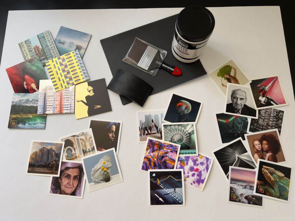
For my paintings, I am interested in working on larger, fine art giclée photo prints, mounted on a hard and durable surface, that I can frame directly. I ordered samples from White Wall to play with: the “Prints and Photo Sample Set,” and the “Aluminum Sample Set.” Further, since I’m also going to sell straight-up photo prints, I ordered a large, glossy test print, using their “UltraHD Photo Print” method.
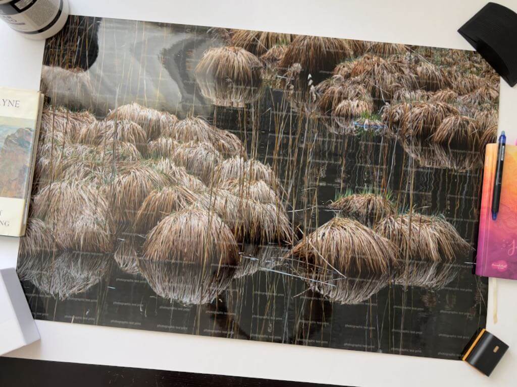
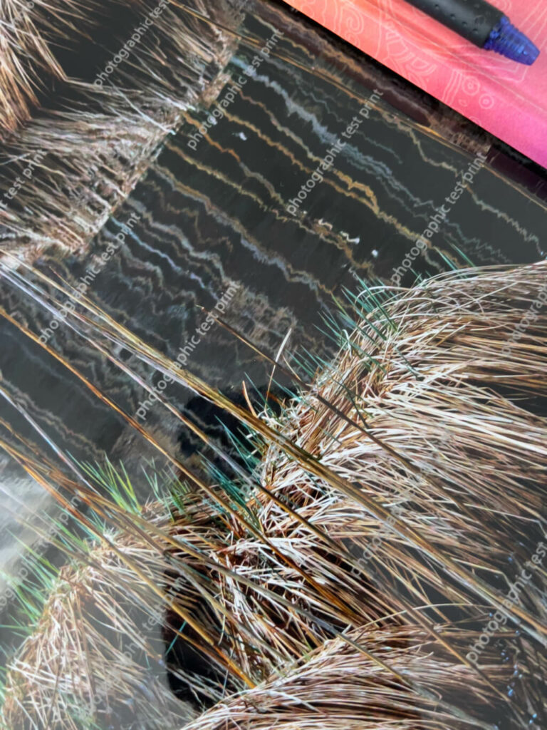
The order has arrived. I am deeply impressed. The samples are so gorgeous, I don’t even want to spoil them by experimenting on them! But I will…
These images are too compressed to do the big, UltraHD test photo print justice—it is AMAZINGLY SHARP.
Choosing Surfaces Suitable for Painting on Photos
While I was waiting for those to arrive, I sent emails to White Wall and Hahnemühle, inquiring about surfaces.
White Wall
I asked for confirmation on White Wall’s most durable paper/aluminum surface combinations, for painting on photos. After describing my intentions, I wrote:
Might any of these surfaces be more suitable? I have selected these because they appear to be coated with a UV protective laminate, or are water-resistant (aluminum) and hangable in bathrooms and rain-sheltered areas.
Fine Art Print On Aluminum Dibond
Direct Print On Aluminum Dibond
ChromaLuxe HD Metal Print (I would rough up the glossy surface, or coat it with a medium, to create a surface that will take pastels)
Photo Print On Aluminum Backing (Fuji Crystal DP Matte)
Photo Print On Wood
They promptly replied:
As far as I understand the process correctly, the materials you have chosen are already a very good choice. Especially the Fine Art on Alu Dibond offers you a clean surface to apply colour etc. to the picture afterwards. We use Hahnemühle and Canson papers for the Fine Art print on Alu Dibond. With direct printing on Alu Dibond, you also have a rough surface that can be easily processed with colours. HD Metal is a very smooth surface, as you correctly say. To be honest, we have hardly any experience with post-processing by artists here, which is why an experiment on your part would be appropriate. Feel free to share your results with us, we are curious about the reactions of our products. Here’s a discount code. [Yay!]
Since I’ve used their papers in the past, I decided to focus on…
Hahnemühle
I wrote to Hahnemühle, describing how I historically work with pastels. Then, I inquired which of the Hahnemühle papers, used by White Wall, might work best for wet and dry media over printed photographs. They also promptly replied:
Everything that White Wall has recommended are Digital Fine Art ink jet papers. All are suitable for your prints, but I would recommend choosing Fine Art Baryta for really dark/black prints, because of the whiteness. Regarding the matte papers, it is more likely a sense of your own taste. The William Turner has a unique structure, the Torchon has much less structure, and the Photo Rag® is a smooth paper. Nevertheless, we do not have any experience with painting on prints, so we are not able to give any recommendations here. Also take a look at our brand new Hahnemühle App with a large knowledge database about fine art printing with Hahnemühle paper.
Methods for Painting on Photos
Curious about how to approach my experiments, I investigated methods for painting on photos using soft pastels, my preferred medium. (I may eventually also try oil pastels, wax encaustic, acrylic paints, oil paints, and/or inks and stains.)
Like everything, soft (chalk) pastel has its pluses and minuses. Pastels consist of pigment, combined with the minimal amount of binder needed to hold the pigment together. Since there is no “carrier” medium (oil, acrylic, wax, etc.), pastels provide rich, bright colors, which is one reason why I prefer them. Painting with pastels avoids problems like cracked surfaces (oils, especially if you don’t paint fat over lean), yellowing (oils, waxes), or the uncertainty of colors drying darker (acrylics). The downside is that with most pastel techniques, the final work needs to be framed under glass to avoid smudging, usually even when it is sprayed with fixative.
Unfortunately, I found a lot of information about using everything except pastels to paint on photographs. But two helpful articles finally surfaced. [NOTE: I often save offline copies of the most useful reference articles I find on the web. This is because over time they tend to disappear. You might consider doing the same.]
Pastels and Gesso
First, I came across this interesting post, a Soft Pastel and Clear Gesso Technique, by Cory Goulet. An abstract pastel and mixed media artist, Goulet describes using clear gesso with a heat gun, to create a textured and toothy surface that accepts layers of pastels nicely. You can layer more gesso, pastel and fixative, and end up with a pigment-holding surface that may not need glass. I have to try it.
A Chapter on Hand-coloring Digital Prints
Second, I found an entire chapter on Handcoloring using water, oil or chalk as a base, from the book New Dimensions in Photo Processes. The section on “Chalk-based methods for hand-coloring digital prints” includes information on safety, materials and methods. Safety is a consideration with any media, and pastels are no exception. Pastel dust has what can be described as little barbs (like a fishhook), and once it lodges in your lungs, it’s probably not coming out.
Stev’nn Hall
I should also mention discovering the art of Stev’nn Hall, whose web site unfortunately doesn’t seem to be working. However, I did find this article, which said:
“To create these works, Hall begins by taking photographs, combining upwards of 40 digital images per piece into a single, comprehensive panoramic view, anchored by a definitive horizon line. Once the image is created in the computer, he prints it and mounts it on birch panel. That’s when the piece really begins to come alive: Hall embellishes the image, painting, scratching, and applying stains, oil paint, pastel, and ink.”
That’s all I’ve learned about his methods for painting on photos. Nonetheless, it’s food for thought.
Selecting a Clear Gesso
Next was determining the best gesso; neither too thick, glossy, or cloudy. Cory Goulet prefers Liquitex, but I wasn’t happy with its apparent milky tone, judging by her in-process photos (I could be wrong). Since I am going to be using the gesso over photographs that I still want partly visible, I need a medium that will be as clear as possible. After reading about several of the better known brands, and their “clear” or “transparent” gessoes, I narrowed my options down to three:
Winsor & Newton Artists’ Acrylic Clear Gesso
Art Spectrum Supertooth Colourfix Pastel Primer
Liquitex Clear Gesso
In the end, I settled on Winsor and Newton’s Artists’ Acrylic Clear Gesso, which they describe as, “completely clear when dry.” Jerry’s Artarama had this to say about it:
Offers excellent tooth for great paint adhesion, fast drying, with a balanced absorbency. The Clear Gesso is exactly that: clear, not milky like some other “clear” gessoes. It can be tinted with acrylics to add some color to your primer or used alone to allow the qualities of your canvas or board to show through. Non-yellowing, flexible, and with all the tooth, absorbency, and fast-drying properties you need. The unpigmented Artists’ Acrylic resin base dries absolutely transparent. Perfect for acrylics, oils, and alkyds, it also makes an excellent ground for charcoals or pastels.
Sold.
Other Supplies for Painting on Photos
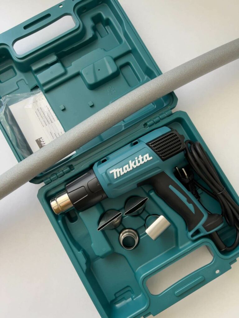
Then came investigating and deciding on a good, large brush for smooth gesso application (hopefully with no lost hairs left behind), procuring the right sandpaper grits to scuff surfaces, and selecting an appropriate heat gun with variable temperatures. Here’s what I ended up getting:
Sandpaper in grits 120, 180 and 240, for sanding surfaces to various smoothnesses
A Makita HG6031VK Variable Temperature Heat Gun
A da Vinci Top Acrylic, Series 5040, wide synthetic brush, 80 mm (a little over 3″)
Unfortunately, I had to order everything, since our local, tiny craft store doesn’t carry serious art supplies.
How it All Looks
At this point, everything has finally arrived. I’m both excited, and intimidated, to start my experiments.
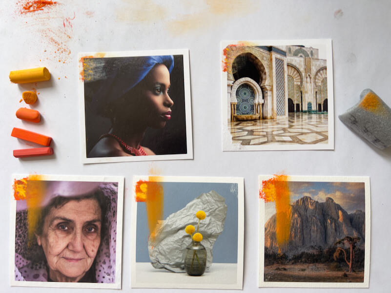
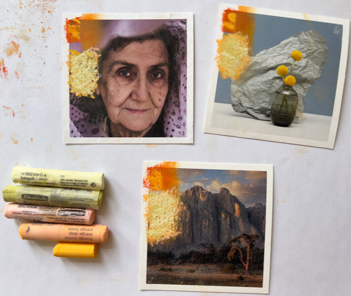
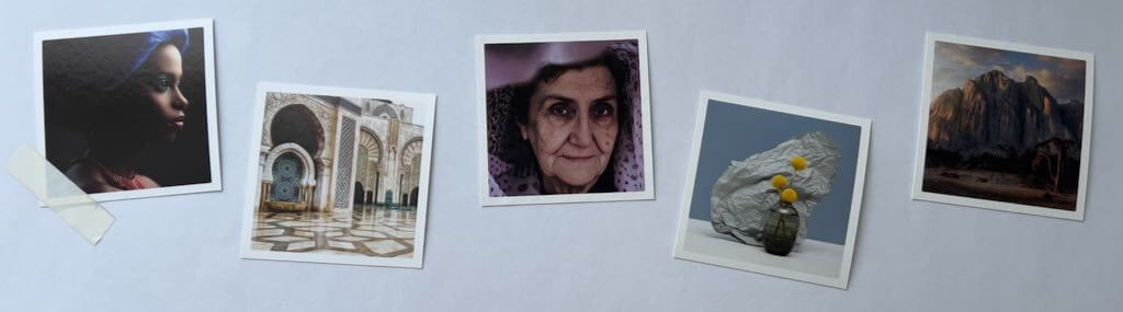
Each of the white-bordered prints shown below is on a different, gorgeous paper. The aluminum sample group is in the upper left, and includes three metallic surfaces that show through the prints, we well as four other surfaces.
The heat gun and pipe insulation.
My First Experiment Towards Painting on Photos
I have decided to test with the Hahnemühle fine art giclée prints first, then move on to the AluDibond.
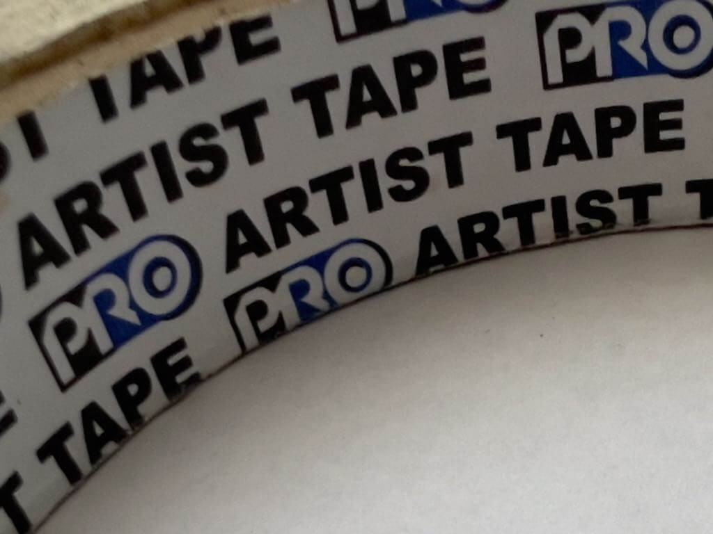
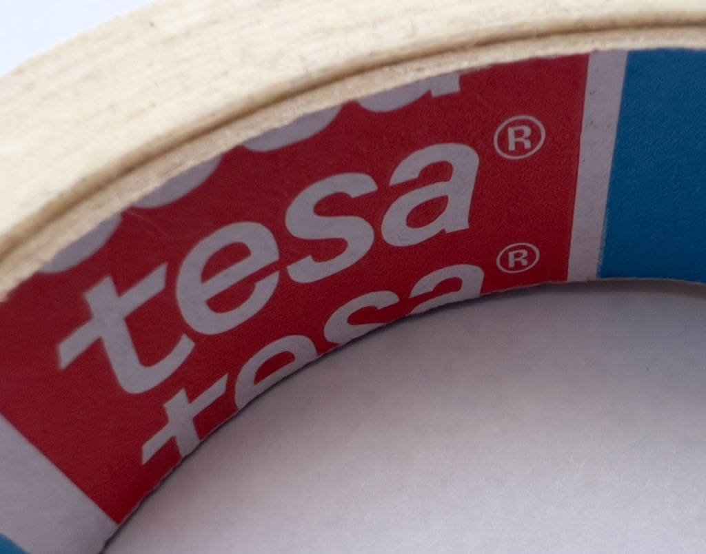
My first experiment was taking two types of tape—”Pro” brand Artist Tape, and a Tesa tape that’s either masking or painter’s—and seeing how they behave on the prints and paper.
The Results Weren’t Great
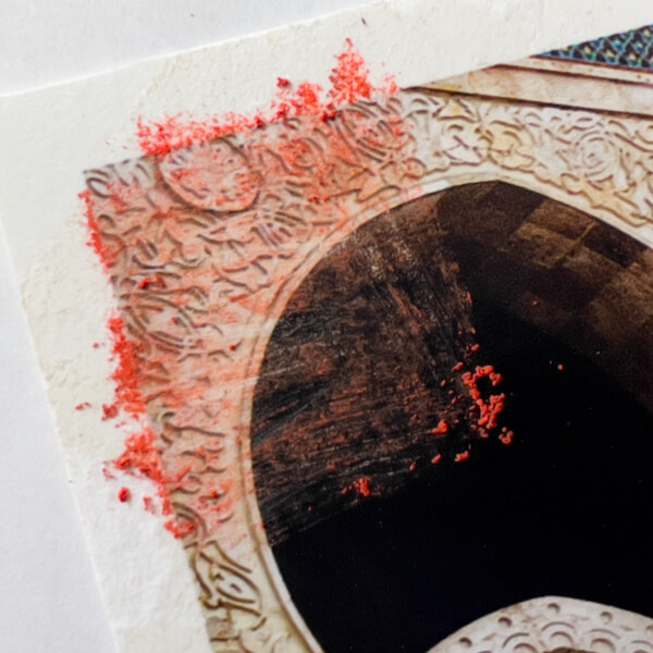
I pressed the tapes on firmly in each test. The “Pro Artist Tape” left a very gummy adhesive residue on the Hahnemühle Baryta. It was impossible to remove. However, it didn’t pull up pigment or paper after firmly sticking for a short time, though I had to peel it off very carefully. Similarly, the Tesa tape left residue too, but less, and still unremovable. Neither pulled up pigment or the paper’s surface, which I am guessing is due to the printed surface.
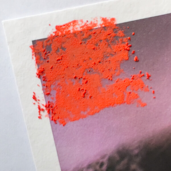
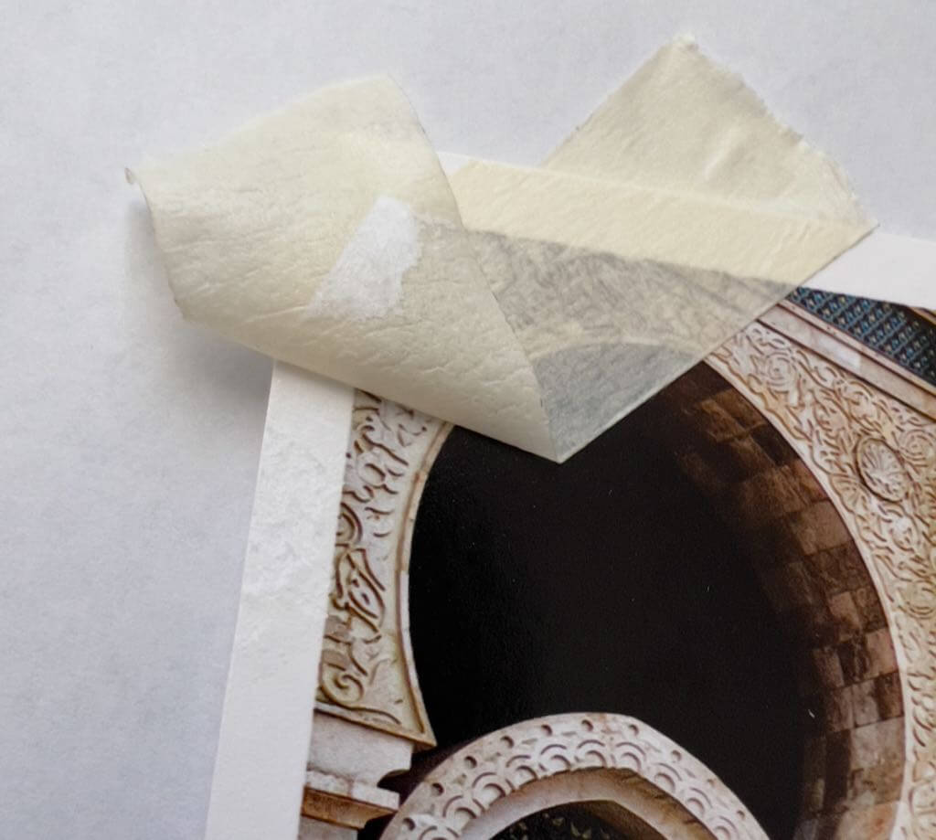
I tried the Pro on the Hahnemühle Pearl, and it pulled up the paper so badly, it ripped into the image.
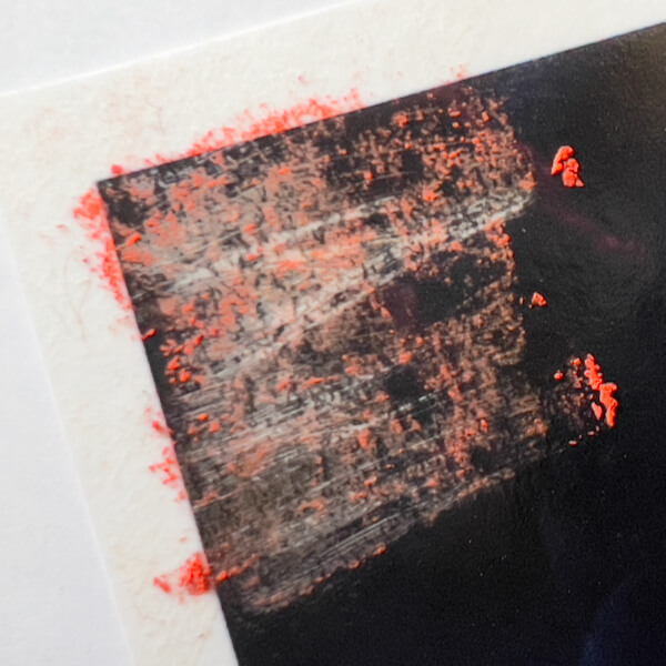
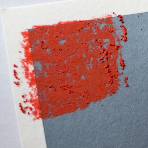
After giving up on the Pro tape, the Tesa tape pulled up pigment on all the matte Hahnemühle papers: the Torchon, Photo Rag, and William Turner. (Paper fibers too, in varying degrees.)
Therefore, if I want to mask portions of photos when applying gesso, I will need to find a different tape. Maybe mine were old or cheap, I’ve had them a while. It’s also possible that all tapes will pull pigment off matte fine art photographic prints.
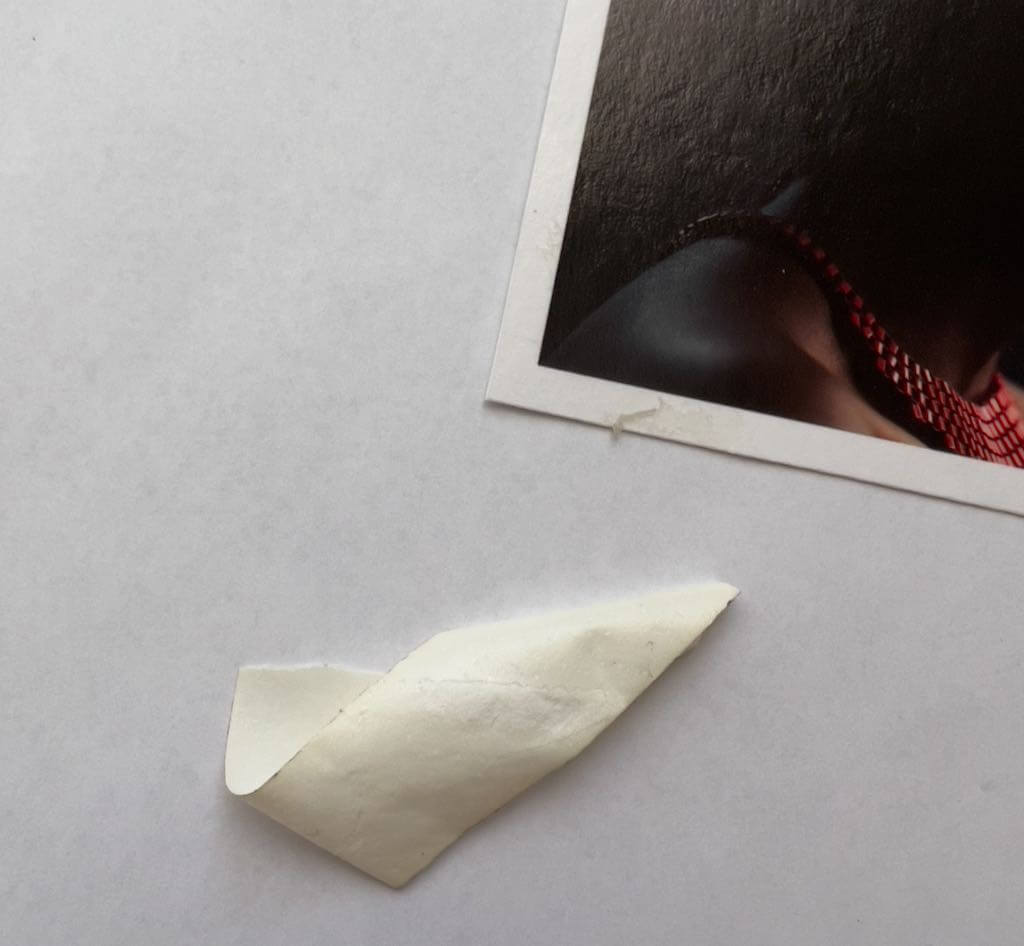
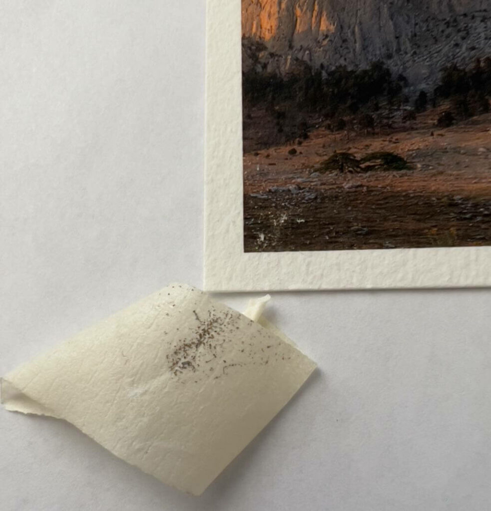
Significant “Pro” tape residue on the Hahnemühle Baryta, hard to see here. Otherwise, no damage. Less residue with the Tesa tape, and no other damage.
Tesa pulls up the paper on the Hahnemühle Pearl, but the pigment was unaffected. The “Pro” tape badly ripped into the image. (Not shown.)
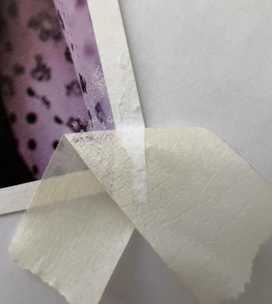
Tesa pulls up the paper and pigment on Hahnemühle Torchon.
Here, Tesa also pulls up the paper and pigment on the Hahnemühle PhotoRag, but the paper damage is minor.
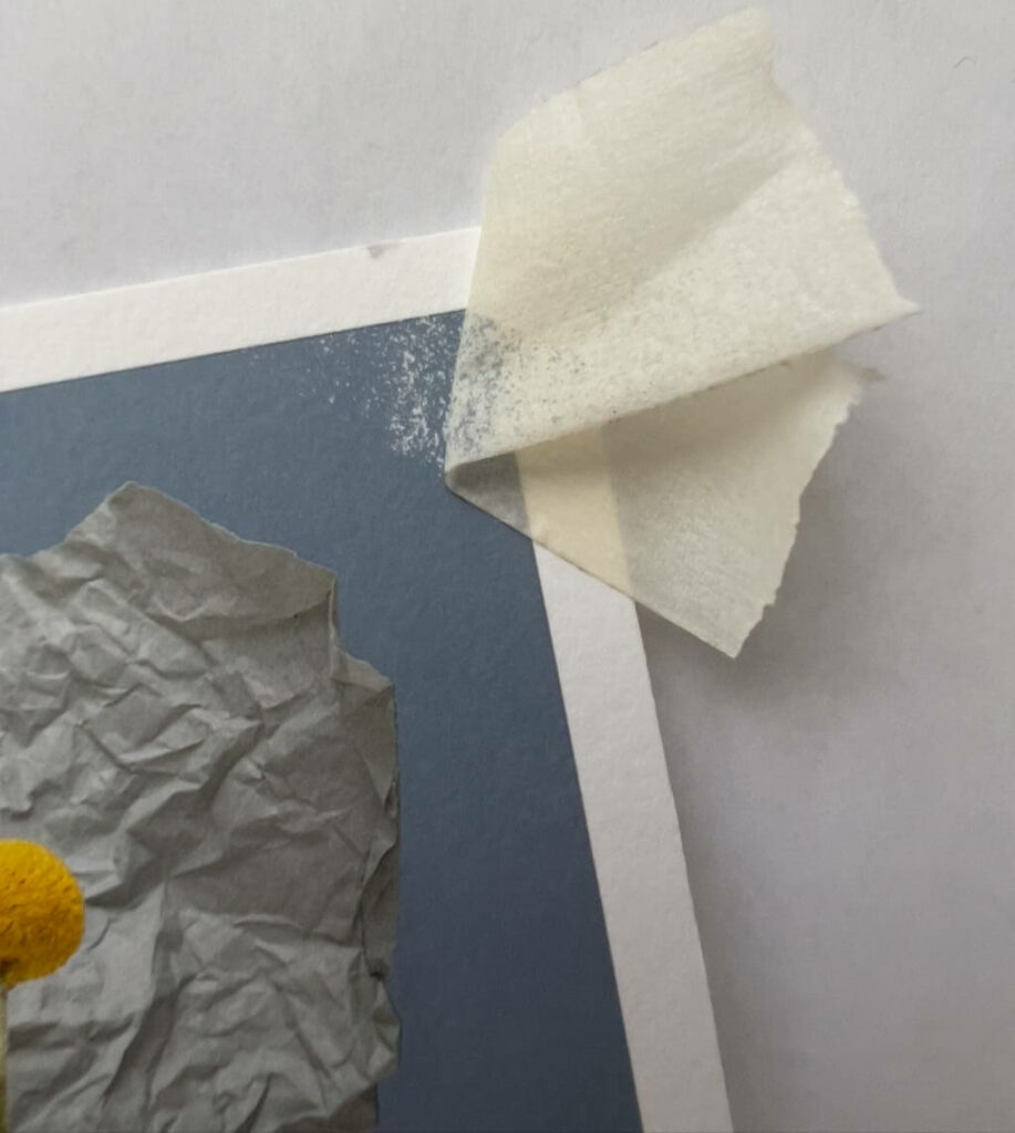
Tesa pulls up pigment on the Hahnemühle William Turner, with very minimal paper damage. (This is a watercolor paper, made to be taped.)
Bottom Line Regarding Tape
The three matte papers—Torchon, Photo Rag, and William Turner—probably shouldn’t be used with tape. This is not a condemnation of them, though, it’s just tape!
Only the gently glossy Hahnemühle Baryta didn’t lose paper or pigment with either tape, but both tapes left adhesive residue on the unprinted paper border.
The second most durable print surface, tape-wise, appears to be the Hahnemühle Pearl. With its pearlescent coating, it didn’t lose pigment with the Tesa, but did retain adhesive on the border, and some of the border paper pulled up.
Ta da! 😆 I know it’s not a lot of actual experimenting, but all the product research and procurement took time. (We were also away on vacation for 12 days.)
There’s still much to do. This week I will try more tests, and report back on my blog soon.
To provide the best experiences, we use technologies like cookies to store and/or access device information. Consenting to these technologies will allow us to process data such as browsing behavior or unique IDs on this site. Not consenting or withdrawing consent, may adversely affect certain features and functions.
Functional
Always active
The technical storage or access is strictly necessary for the legitimate purpose of enabling the use of a specific service explicitly requested by the subscriber or user, or for the sole purpose of carrying out the transmission of a communication over an electronic communications network.
Preferences
The technical storage or access is necessary for the legitimate purpose of storing preferences that are not requested by the subscriber or user.
Statistics
The technical storage or access that is used exclusively for statistical purposes.The technical storage or access that is used exclusively for anonymous statistical purposes. Without a subpoena, voluntary compliance on the part of your Internet Service Provider, or additional records from a third party, information stored or retrieved for this purpose alone cannot usually be used to identify you.
Marketing
The technical storage or access is required to create user profiles to send advertising, or to track the user on a website or across several websites for similar marketing purposes.